HOMEABOUT MERESUMETUTORIALSMY FAVES

Tuesday, October 30, 2012

Fall Memories Layout

Good morning fellow scrappers! Today I bring you yet another Autumn themed page.  I can't say this enough--but Autumn is my absolute fave season!  The beautiful & colorful foliage, the pumpkin lattes, the pumpkin everything!  Pies, scones, muffins you name them--they're all good!   That wonderful crisp morning air!  Just love it all...

Fall also holds a very special place in both the hearts of my husband & I.  We were married in the Fall 5 years ago in October.  So here we are, celebrating our 5th year wedding anniversary.  We decided to go back to where we celebrated our 1st wedding anniversary--a quaint & quiet bed & breakfast in Pocono Pines, PA.  The foliage during this time of year in Pennsylvania is absolutely gorgeous.  We took this picture in the same exact spot that we took a photo 5 years ago.  We're even wearing the same clothes!  :-)  Here's a page I did based on our 1st wedding anniversary--you'll notice that both our outfits and the background scenery are pretty much the same.

This is also a DT page for Clear Scraps & I'm entering this page in the most current challenge going on over at Bird Is The Word (BITW).  The theme is Seasons--Winter, Spring, Summer or Fall.

I've used one of Nadia's sketches from an older OUAS challenge for my page.
Something that has become very routine with me lately is to store my journaling in the form of a scroll.  I have a brief tutorial on how I go about making my scroll journaling right here on my blog.  You can find the tutorial here.  I had a good amount of story telling for this page & storing the journaling in the form of a scroll doesn't take up too much space on my page & makes for a unique embellishment!
The number '5' represents the number of years we've been married.  I added simple texture to my number--I inked up the number with embossing ink & heat embossed it with Star Dust embossing powder by Stampendous.  In person, this number gives off a lovely shimmer.

Here you can also see a small glass vial that I filled up with colorful beads from my stash.  I tied a bit of twine around the neck of the bottle.  The twine is from Riddersholm Designs.

A long strip of dark orange burlap ribbon is in the foremost background of my page.
I used a couple of ivory colored rosette flowers, mini pinecones & other random Fall themed embellishments from my stash.  The fabric dark brown leaves are by Prima.
This large fabric orange flower is by Prima.  I tucked a bit of yellow & green tulle underneath this large flower to soften the page a bit.
This is the acrylic Pennant Banner by Clear Scraps.  I altered this banner in several ways.

First I colored them with several alcohol inks.  I used Lake Mist, Copper, Meadow & Sunset Orange alcohol inks.  On some of the banners I randomly applied drops of alcohol ink directly from the bottle.  This creates more dramatic designs on the acrylic.  Next with my crop-a-dile I punched 2 holes into each banner, ran green ribbon through them & finally a string of dark brown burlap twine to hold my banner together.  Last step was to add dots of Gold Stickles all along the edges of each pennant in order to define them more.
This flower was handmade.  I used a piece of a 12x12 Acrylic Sheet by Clear Scraps to create it.  I shared a tutorial on how I created this flower over on the Clear Scraps blog.  So if interested, feel free to check it out.

Thanks to all of you who stop by for a visit.  Enjoy the rest of the week!
Photobucket

Friday, October 19, 2012

To Catch A Thief Layout

Hello again fellow scrappers!  Today I'm presenting a page that I made for the latest C.S.I Challenge.  I'm also entering this into the Berry71bleu mixed media challenge going on during this month.  Similar to my 'She Gave Me Wings' page, I once again ended up using several mixed media to achieve the texture you see in my background.

I had actually made this page previously but have been wanting to remake it for some time now since my scrapbooking style has evolved so much during this past year or so.  I was amazed myself when I saw how different my style is today than it was about 2 years ago.  When I first started scrapbooking I kept it safe & simple.  Now, I'm definitely more diverse & take more risks.  I also tend to make my own backgrounds with either stamps or with the use of mixed media.

The theme of this page hasn't changed at all these past few years though--I'm still very much a pen thief and am notorious for swiping them when you least expect it!  :-) I honestly don't mean to do it though--it's just a very bad habit of mine.  My journaling explains it all which is stored in the little pocket on a tag that is pulled out with the use of the tassel.  Journaling reads:

Pens...I buy them, I collect them & yes, I unintentionally steal them. There isn't one cube in my office that I haven't hit. They are left carelessly thrown on top of desks & on shelves. When I visit, I tend to pick these pens up & play with them in my hands while I talk shop. When I walk out of the cube--the pen is still in my hand. It eventually lands into one of the 3 mugs I have on my desk that I use to hold all of my pens. Sometimes, the pen makes it's way back to it's original owner--but most of the time it stays with me & added to my always-growing collection both in the office & at home.
Keep your pens locked up my friends, I come when unexpected & I'm a quiet thief unknown to most including myself. It's a habit I cannot break nor control. I strike by day or night, early or late...
Catch me, if you can...
Here's the C.S.I Case File that I based my page on.

Evidence is as follows: gold elements, texture & tassels

Testimony: I used the 'Journal of Secrets' since this is a secret that I'm willing to share
The chippies are by the Dusty Attic.  I added a couple of elements to these guys as well in order to give them a bit of texture.  I started off by painting them with gesso--once dry I randomly spread Peachy Keen Shimmerz paint & Sunkissed Peach glimmer mist all along my chippies with a thin paint brush.  I then hit my chippies with my heat gun.  Finally, I added Glossy Accents by Ranger to my chippies to give them that epoxy look.
I used a couple of pen nibs by Tim Holtz to convey the theme of my page.  You can see my tag & journaling peeking out from it's pocket here.  The tassel is used to pull the tag out of it's pocket.

I edited my photo with Photoshop.  I felt that turning my photo into a 'pencil sketch' went along with the theme of this page as well.
The doilies I bought from JoAnne's Fabric store.  Resin bird is by Prima.
The metal plate is by Tim Holtz & I felt the statement fit this page perfectly.  'Embrace Imperfection'.  Lord knows I'm anything but perfect & have several bad habits such as this one!
I also randomly added dots of Crystal Ice Stickles & mint rhinestones to my background.  You can find them scattered around here and there.

Large rhinestone button is by Zeus & Zoe.
To give my background some texture I started off with randomly spreading gesso with a sponge.  While the gesso was still wet, I applied the following: gold embossing powder by Stampendous, Dried Marigold & Spiced Marmalade distress embossing powder, gold chunky leaf glitter by Martha Stewart & Gilded Mica fragments by Stampendous.  I then hit the entire background with my heat gun in order to melt the embossing powders.  Once my background was dry I randomly spritzed some Sunkissed Peach glimmer mist & wrapped it all up by randomly spreading some Frosty's Got The Blues Shimmerz paint.  Phew...all that for one background!
The large light peach flower is by Manor House Creations.  Wooden clocks are by Prima.

Thanks to all of you who stop by for a visit.  Have a great weekend everybody!
Photobucket

Tuesday, October 16, 2012

Capture the Good Times Layout

Hello once again fellow scrappers!  Time to reveal yet another page for the latest Once Upon A Sketch (OUAS) challenge.  The challenge for this month was to use a quote in combination with the usual provided sketch.  We could interpret the quote anyway we wanted.

I've also used an XL acrylic Deco shape by Clear Scraps on this page.

All paper used on this page was sponsored by Riddersholm Design & is from their Christmas Story collection.  I wanted to show how versatile these papers were in using them in a non-Christmas themed layout.  They are beautiful papers for either Christmas or non-Christmas themed projects!

Not many know this--but I suppose this is a good time as any to tell.  I'm actually expecting my first child & he's due in a few weeks time (yes, it's a boy).  To us though our fur-baby Toby is our 'eldest' son.  My family are huge animal lovers and ever since I can remember we always saw the pets in our household as simply another member of the family.  Plus it doesn't help that Toby really does act like he's a child trapped in a furry body.  Here is just one example of that.  Toby has been curious about my growing belly for some time now.  Well this October afternoon he simply came up to me and started sniffing around my tummy--eventually he just stood up & felt it--as if he were trying to figure out what's going on inside this growing tummy.  Luckily my husband was around & he snapped this photo.

Here's the sketch provided by Nadia that my page is based on.
Here's the quote that was provided.  I focused more on the 'capture the good times' part of the quote.  I felt that this photo was very candid, sweet & am very grateful that I was able to capture this one moment.  It's one I don't wish to forget.
I used an actual negative from a film strip that I had in my stash as  part of my embellishments.  The burgundy ribbon was sponsored by Scrapbooking Fantasies & I used it on both my journaling tag and for this arrangement of flowers, beaded vines & twine.  There's a bit of moss jute ribbon in the background, mini pine cones (since this photo was taken in Autumn--my fave season!) a small glass vial full of black glass beads & a light bulb trinket by Prima.  The twine & white mulberry paper roses were also sponsored by Riddersholm Design.
To give my large acrylic shape some texture I first randomly inked along all the edges with Pesto, Currant & Silver alcohol ink.  I then broke out my stamps & stamped some images with jet black StazOn.  TIP: Always remember to use permanent solvent ink when stamping on non-pourous surfaces such as acrylic.  I've always used StazOn for this kind of stamping.  Using other kind of ink such as pigment or dye will cause your image to smear.
A close up of more stamping.  This is the beauty of acrylic...it's see through--so any images you put on it or behind it show.  In this close up you can see some random splatter stamping that I did on the background paper with brown ink as well as my black stamping that was done directly on the acrylic.
A close up of the alcohol ink--that Silver ink really adds a nice sheen to the edges!  To dress up my border a bit more I added some dots of Silver Stickles as well.
I tucked a bit of ivory tulle underneath this very pretty handmade flower.  This flower is from an Etsy shop called More Paper Than Shoes.  Anna, the owner, makes many lovely handmade flowers such as these.
This tag holds my journaling (it's on the backside of the tag).  It's actually a journaling ticket by Tim Holtz that I turned into a tag.  I just punched a hole on the top & ran some ribbon through.  The edges were inked with a bit of Vintage Photo distress ink.
This lovely large burgundy flower is by Manor House Creations.

Thanks to all of you who stop by for a visit--it's always very much appreciated.  Do remember to swing by the OUAS blog & see the other DT's interpretation of the current challenge & do play along if you can!

Also, I hope this post inspired some of you to get creative with your acrylic--break out those stamps and alcohol inks & just get messy!  You can always find this & many more acrylic goodies at Clear Scraps.

Have a great rest of the week!
Photobucket

Saturday, September 29, 2012

Abuelita Layout

Hello again fellow scrappers & bloggers!  Today I bring you my debut DT page for Clear Scraps.

I used the 12x12 acrylic sheet as the background for my page & implemented a couple of techniques to give it some color & texture.

This page is a tribute to my grandmother who left my side in 2006 (but not my heart).  She came from Chile to help my mom raise me when I was 3 years old.  In this photo I'm approximately 3 years old.  As you can see, even though I had just recently met her--I was already quite close to her.  She was by my side till the very end. I have been looking for just the right project to showcase this picture of us--and this turned out to be it.

Since the background is completely transparent--this was a bit hard to photograph just right.  I ended up putting the layout against my hard wood floors.  So that's actually my floor you see coming through the background--not really part of my page.  Love the effect acrylic gives!  Adding paints, textures & embellishments take on a whole new look when your background is transparent.

I also ended up submitting this for the CSI challenge, case #38.  I liked the color palette for this case & felt that it would suite my project perfectly.
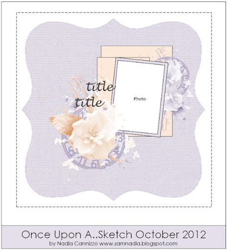
Here's the CSI challenge & sketch provided by Nadia from OUAS that my page is based on.  For this month only CSI & OUAS has joined forces--so in addition to the color palette we had Nadia's lovely sketches to incorporate into our work.

For my evidence I have: birds, flowers & a border.

For my testimony I have: inspiration words--I used 'together' on my page & also used together in my journaling
Here's a close up of how I gave my acrylic background a bit of texture.

First the border was made with a large home made mask.  My mask covered most of my page.  I then dabbed copper, lettuce, slate & sandal alcohol inks all along the border.  To further accentuate my masked border I added Bisque Liquid Pearl dots.

Next I used a misting mask by Pink Paislee to create the design going down the center of my page.  This was done by dabbing an olive colored acrylic paint along my mask.  While the paint was still wet I sprinkled some Pralines & Cream fairy dust glitter by Donna Salazar & copper chunky leaf glitter by Martha Stewart on it.
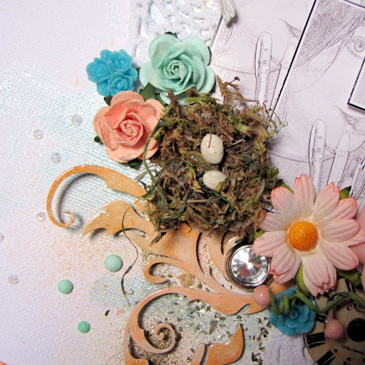
My flowers are a combination of fabric, resin & mulberry flowers. The grayish blue flower seen here is by Prima as is the tiny green resin flower peeking out from underneath it.  The little nest is also by Prima as are the rhinestone flourishes.
This very lovely large green flower is by Manor House Creations.  This is from their Winter Song collection called 'Log Cabin'.   I've tucked a bit of off white tulle underneath my flower--this has become a bit of a tradition for me lately.  Adding tulle underneath flowers adds a nice soft touch to my pages.
I've stored my journaling in the form of a scroll.  You can find a tutorial on how I make my scroll journaling here.
I managed to get my hands on some paper cord--also called jute and made a make shift circle frame around my photos.   My photos are matted on a piece of corrugated cardboard and some glassine paper by Tim Holtz.  The glassine has been wrinkled by hand several times & I then smeared some Walnut Stain Distress ink on it.  The ink is 'baked' into the glassine by heat setting it.  A tip I got from Mr. Tim Holtz himself.
This is one of my newest butterflies that will be added to my Etsy shop soon.  I really like the 'Autumn' feel of these little guys.
A close up of the texture added to the corrugated cardboard.  This was done by randomly applying a bit of gesso--while wet I spread some Weathered Wood Distress embossing powder &  Molten Metal enamelz by Shimmerz & heat set it.  To wrap it up I inked the edges with a bit of Walnut Stain & Aged Mahogany distress inks & spritzed the entire corrugated cardboard with Biscotti Perfect Pearl mists.

Thanks to all of you who stop by!

Enjoy the rest of the week...
Photobucket

Friday, September 28, 2012

She Gave Me Wings Layout

Hello fellow scrappers!  I'm sure you're all aware by now that during this month of September, Once Upon A Sketch (OUAS) has teamed up with CSI.  It's finally my turn to present my project!  I thoroughly enjoy CSI & have been a fan since it's debut.  I play along whenever I can--so for me this was a very fun experience!

I also recently discovered Berry71Bleu & saw that they're having a mixed media challenge this month--I decided to submit this page to their challenge as well.

I decided to do a page based on my mom.  That would be her in the photo and believe it or not, that's me she's holding!  :-)  I was about 3 months old in this photo. Up to a certain point in my life--my mom raised me by herself.  She played a big role in shaping the person that I am today.  She made me to be very strong, independent, proud & ambitious. She was big on education--and thanks to her support I'm the first in my family to earn a college degree.  I didn't stop at a Bachelors either--I have both my Bachelors & my Masters in Management Information Systems.  She's also to thank for me being fluent in Spanish.  Being 100% bilingual has been extremely beneficial in both my personal & professional career.  It's no surprise that most mothers play an important & loving role in our lives--mine is no exception and this is my tribute to the role she played in mine.
Here's the CSI challenge & the sketch provided by Nadia from OUAS that my page is based on.  I absolutely loved the color palette for this one.  To me they were bright, happy & just right for the theme of my page.

For my evidence I included: bird, little bits & pieces & a frame.  For my testimony I have: my journaling in the form of a booklet.
Here's one of the two birds I included on my page.  The resin bird is by Prima as is the cute little nest.  I included a glass vial as part of my random embellies filled with beads from my stash.  I also included some tiles that I've had in my stash for ages.  The title was printed on a transparency.
Here's my little hand made journaling booklet.  I have made a brief tutorial on how I went about creating this booklet.  I loved the idea!  This is yet another way of including large journaling on your layout where the journaling doesn't crowd your page, you can keep it private & it actually adds a unique embellishment to your layout.  You can find the tutorial here.

You can see my 2nd bird here.  This bird is an image I printed via my own computer.
Here are my bits & pieces embedded into my background which is full of texture.  I absolutely loved how my background came out!  It was the first time I got dirty & messy with gesso.  A big thanks goes to Nadia Cannizzo who provided a tutorial on her blog on how to create mesh & gesso backgrounds.  You can find that tutorial here.  The only thing I did differently was that while the gesso was still wet, I added both chunky leaf glitter by Martha Stewart and beads from my stash to add even more texture.  I then let it dry overnight.  TIP: make sure that in the areas that you plan on adding beads or glitter or any other bits & bobs; that you are very generous with your gesso.  You want your items to sink into your gesso without being drowned so that when they dry--they stick & stay!  I colored my background with a mixture of Riptide & Yellow Daisy glimmer mists.
This very pretty flower I bought from an Etsy shop called Funtoolas.  It's fairly large, made out of fabric and very colorful & bright in person.  I tucked a bit of light aqua tulle underneath my flower as well as a yellow & teal feather.
The chipboard frame around my photo is by Imaginarium Designs.  It was inked in both a light & dark orange acrylic paint then heat embossed with Star Dust transparent embossing powder by Stampendous.  In person this frame is very shimmery & blingy!
Here's what my journaling booklet looks like when unfolded.  See how much info you can store in this lil' booklet?  Love it!

Thanks for stopping by--I very much appreciate your visit.  Do take the time to visit both the CSI & OUAS blogs to check out what the other talented DT members did with this challenge--you won't be disappointed!  As always, do play along if you can!

Have a great day!
Photobucket

Wednesday, September 19, 2012

Clear Scraps Projects

Good evening fellow scrappers!  Today I thought I'd share some of the projects I've made in the past where I've used Clear Scraps products.  I've loved the concept of acrylic for a long time now.  At first, acrylic may be a bit intimidating since it's see through--but after a bit of experimenting I found that it's this clear nature that makes acrylic such a great product for scrap booking or card making!

You can apply paint on it, dry emboss it (you can even heat emboss it with a bit of patience), apply alcohol inks to it, punch holes through it with your crop-a-dile, stamp on it etc...

My first project is actually a new, never before seen criss cross card.  I used a scallop acrylic circle by Clear Scraps on this card.  I inked it with alcohol inks and dry embossed it.  Finally, I wrapped a bit of string around it.

A close up of the chippie brick wall.  This chipboard is by Dusty Attic.  You can find a tutorial here on how I give the brick wall it's texture.
Here you can see a better look at the acrylic and the effects/texture the embossing & alcohol inks gave it.
A close up of my little flower cluster.  I tucked a bit of pink tulle from underneath my flowers
The image is a stamp by Kenny K called "Queens Cutie".  I colored her in with Prismacolor Pencils.  I wish I was better at coloring.  I honestly do my own thing when it comes to coloring images.  I was actually experimenting with a new coloring method with this image & I ended up with a light/pastel sorta coloring.  I liked it though!  As usual I dressed up my image a bit more by highlighting parts of her hair and outfit with Star Dust stickles.
On this next layout I used an XL heart shape by Clear Scraps in the background.  I once again used alcohol inks on the edges.  Since the heart is see through you can see some of my splatter stamping right through the heart. I also used my crop-a-dile and punched a few holes underneath my photo where I strung a bit of black tulle through.  Finally I randomly added a bit of stickles along the hearts edge & also added some eyelets.  You can find more close ups & details on this page here.
For this page I used yet another XL shape by Clear Scraps.  This one is a large scallop circle.  For this one I applied a bit of molding paste on the edges & sprinkled some Mahogany Distress embossing powder on it. I then very carefully heat embossed it.

As mentioned before, you actually can heat emboss acrylic...but you have to do it with patience.  If you just hit your acrylic directly and too close with the heat gun--the acrylic with warp & twist.  So you heat emboss it a little at a time and from a good enough distance where it doesn't really warp the acrylic but does manage to emboss.  It may take a little time & practice--but the results are really worth it!  You can find more details & close ups on this layout here.
Finally I have this really cute mini owl album.  The entire album is made from acrylic and is also by Clear Scraps.  This lil' guy measures approximately 3" inches in height!

As you can see from the various photos...I did a couple of things here.  I adhered paper directly onto the acrylic, I embossed some of the acrylic, I applied some alcohol ink, I punched holes and thread ribbon through it & I applied stickles along the edges.  I really love how this little keepsake album came out!  You can find more photos, details & how to's on this mini album here.

I hope these projects motivate some of you to experiment with acrylic!  It truly is a versatile product!  Enjoy the rest of the week...
Photobucket