HOMEABOUT MERESUMETUTORIALSMY FAVES

Friday, February 24, 2012

The Journey Awakens the Soul Layout


Happy TGIF fellow scrappers! I can't say that I'm not thrilled that it's Friday & the weekend is ahead of me. Just being able to sleep past 6:30 a.m. is such a treat!

Today's page is based on a vacation to Puerto Rico my husband & I went to just this past September. It was our very first vacation where we actually went with friends. It was different for us--but a good kind of different. You definitely bond in ways you never thought of when you travel with others who are not family. You learn from one another & you simply get to know each other better! We all work in large corporations where stress is a common part of our daily routine. So this trip truly did 'awaken our souls'. We so very much needed the escape. I'm glad our trip went well and we hope to do another one soon!

This photo shows all six of us in Fort San Cristobal in Old San Juan. I have very limited photos where all six of us are together since it was usually one of us taking the group shots. For this photo I remember positioning the camera on top of a trash bin & setting the timer! Hey...it worked right?

I'm submitting this page for two challenges. Bird is the Word (BITW) for their Journey challenge & Once Upon a Sketch (OUAS) February 15th challenge. For OUAS the challenge was to scrap vacations. Either a recent vacation...one I'd like to go on or a favorite vacation.

Here's the sketch provided to us by Nadia over at OUAS.

I went with green embellies/accents to go along with my page. The papers are a combination of Prima & BoBunny.

The large swirls on the side are actually stamps by Prima. I stamped the swirls with Staz On Jet Black Ink--then cut along the flourish to create the border. I then further decorated the swirls with Stickles.

Lime green trim by Websters Pages was tucked underneath my scroll border.

The light green/silver flourishes are by Tim Holtz & made out of grunge board. They were first painted with a lime green acrylic paint. I then randomly dabbed a bit of Silver Paint Dabber on them. Finally, they were inked with embossing ink & heat embossed with transparent Star Dust embossing powder by Stampendous. In person, these flourishes give off a fabulous dimensional shimmer.

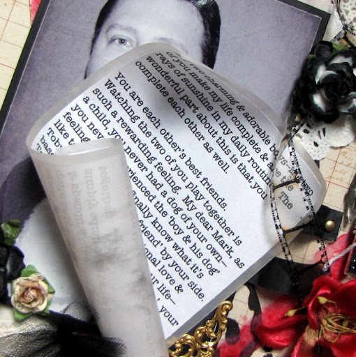
The journaling was made with my Dymo Caption maker and the title is actually a stamp by Tim Holtz (Stampers Anonymous). I stamped the image onto a transparency with embossing ink & heat embossed it with black embossing powder. NOTE: You have to be a bit careful when heat embossing on transparencies--you don't want to melt or warp the transparency. So it takes a light hand and a bit of patience. However, the end result is worth it. It's hard to tell from the photo but in person the title has a dimensional, almost epoxy look to it.

I punched a few holes into my large black circle & tied some lime ribbon through the holes. The transparent compass and globe is by Tattered Angels. The mulberry flowers are from my stash, the resin flowers are by Prima and the fabric rosette is by BoBunny.

Thanks to all of you who stop by for a visit...your time is always very much appreciated! Have a great weekend.
Photobucket

Saturday, February 18, 2012

Altered Ink Box


Good evening fellow scrappers! Today I'm posting a wooden box that I altered some time in November of 2011. This is actually a box that I bought at my local craft store Michaels for $1.

The box itself was painted & heat embossed--then embellished with many bits, bobs & trinkets.

I use this box to hold samples of all my inks. I have just about all of the Distress Inks by Tim Holtz and many of the Adirondack dye inks by Ranger plus a few others from other brands. Having all of my inks handy in one location makes it easier for me to mix n' match colors for my projects.

The cover consists of a glimmer glass owl & a bronze key by Tattered Angels. The owl's belly is a metal clock by Tim Holtz. The flowers consist of a few mulberry paper flowers from my stash & a handmade 'frosted flower'. You can find a tutorial for the vellum frosted flower here.

The clear film strip is by Tim Holtz.

The key hole is once again by Tim Holtz. I used Star Dust glitter to give the key hole some shimmer. The transparent flourishes were cut out from a larger transparent overlay by Hambly.

The glass vial is by Tim Holtz. (Lots of Tim Holtz goodies it seems). I filled the glass vial with black beads from my stash. The bird is also cut out from a Hambly overlay.

Now to go into a bit more detail on how I gave the box it's texture. The box was first painted with pink acrylic paint. Once dry I randomly inked the box with embossing ink & heat embossed it with Mahogany distress embossing powder. Finally I lightly dry brushed it with a bit of cream/ivory acrylic paint.

Thanks for stopping by & enjoy the rest of the weekend!
Photobucket

Saturday, February 11, 2012

Charming Adorable Sweet Layout


Good evening fellow scrappers! With Valentine's Day around the corner, it felt very appropriate to play along with the February 1st challenge going on over at Once Upon A Sketch (OUAS). The topic of the challenge was none other than 'Love'. We had to scrap a male in our lives that is very special to us.

Well, I have two very special guys in my life. One would be my husband--the other would be my fur baby Toby. Technically Toby is the special little guy in both our lives. He gives us unconditional love & happiness...he's our little ray of sunshine. As you can see in this photo--Toby is quite the ham. He always seems to smile in his photos.

Here's the sketch the page is based on...I sorta flipped it and used the large acrylic heart for the circle in the background.

The large acrylic circle is by Clear Scraps. I inked the edges with Red Pepper alcohol ink--then further decorated it by adding gold Stickles, eyelets, black pearls & a couple of Prima Pebbles.

The film strip is by Tim Holtz. I twisted it & adhered it as such in order to give my page more dimension.

I punched a few holes into my heart & added a touch of tulle.

The title was part of the paper itself. I cut it out & then adhered it with some foam dots. I didn't want this part of the paper to be covered up with my heart--plus it was the perfect title. Cutting it out was a way to salvage it & use it as my title.

Here are all of the bits & bobs I used. The glass vial, Love Key, clasp, pen nib & memo pin are all by Tim Holtz. Tim Holtz products are still the best in my book to add masculine touches to a male themed page.

I once again used a scroll to hold my journaling. I first used a scroll to hold my journaling in my 'It All Began With A Promise' page.

I created the 'straps' that hold my journaling from 2 strips of strong card stock. The journaling itself is printed on plain white paper & then matted with vellum in order to give it the look of an actual scroll. The scroll itself measures approximately 3 3/4" x 6 3/4".
TIP: If you have a story to tell and don't want to take up too much room on your page--try using a scroll to hold your journaling. This also adds a unique embellishment to your page.

Here I'm displaying the scroll unrolled--as you can see you can store a good sized story, thoughts, poems, quotes etc. this way. NOTE: Remember to not obstruct your scroll once you decide where to put it on your page. You need to be able to slide your journaling out so always leave one side unobstructed.

Thanks for taking the time to visit! I hope you all have a fabulous Valentine's Day alongside your loved ones.
Photobucket

Saturday, February 4, 2012

Family Layout


Hello once again fellow scrappers! Today's page is a favorite of mine. I absolutely love this candid shot of myself with my two fave guys--my husband & my little fur-baby Toby.

I used papers by Kaisercraft's Chapter One collection. It coordinated perfectly with the colors in the photo itself. The colors also went just right for Case File #4 going on over at C.S.I. To create the inner frame--I cut a large triangular shape into my paper and then 'peeled' it back, rolled it once and just left the outer corner out. (I hope that makes sense!) Oh & prior to adhering everything down I inked all the edges to make them stand out more.

This is the challenge from C.S.I my page is based on.

This is a stamp by Stamp Enjoy. I further decorated the image with Stickles & inked the edges to make it stand out more.

I used Martha Stewart's Deco Flowers punch for the border. The edges were inked to allow them to stand out more. I further highlighted the border with dots of white opal liquid pearls.

The flourish chipboard frame seen here is by Dusty Attic. I painted it first with white acrylic paint & then heat embossed it with clear Star Dust embossing powder by Stampendous.

Another very cute stamp by Stamp Enjoy. The large spray is by Petaloo. It's one of their Color Me Crazy Sprays...I spritzed it with a teal glimmer mist so it would match my page.

The label holding my title is also by Dusty Attic. The label went through a couple extra steps in order to give it more texture. It was first painted with a teal/blue metallic acrylic paint. I then gave it a coat of clear crackle paint (Rock Candy). Once dry I lightly spread a bit of Frosted Lace Stickles on it with my finger. I added more Frosted Lace in the center of the label & spread it out thinner with my finger towards the edges. I next highlighted the edges of the label with Stickles and finished it up by adding two rhinestones.

Thanks to all of you who stop by for a visit and I hope you all have a fabulous weekend!
Photobucket