HOMEABOUT MERESUMETUTORIALSMY FAVES

Monday, March 12, 2012

Puppy Love Layout


Good evening fellow scrappers! I'm a bit late in posting this page. This was done for Color Combos Galore (CCG) Challenge #221.

This would be me & my fur-baby Toby. Toby was barely 4 months old here! Sometimes I can't believe that he was this tiny. Now he weighs a whopping 16 lbs! No matter how much he grows though...he'll always be my 'little boy'.

Here's the CCG challenge my page is based on. I used all the colors from the palette & incorporated a few wooden embellies & a couple of owls as inspired by the wooden owls in the challenge.

The background of the layout was hand cut. I just traced a large scallop mask I have over plain ivory card stock and hand cut it out. I then inked the edges with a bit of Peeled Paint distress ink.

The half heart circle is made out of wood. The flocked pup is from my stash.

You can see a bit of the hand stitching in this screen shot. I once again combined the zig-zag stitch with the straight stitch to add a bit of texture.

The brown flourishes going straight down my page is actually a stamp by Hampton Art.

The corner grunge stamp is by Stamp Enjoy. I first stamped the image onto a transparency with black Staz On and then cut it out. This way I was able to place the image exactly where I wanted it.

The triple owls is a stamp by Sideshow Stamps. Like my corner stamp--the owls were stamped onto a transparency with black Staz On and then cut out. TIP: stamping images on transparencies allows you to place your images wherever you wish. Just remember to use a permanent ink like Staz On or else your image will smear.

The large owl sitting in my vine is a glimmer glass by Tattered Angels.

The vine is a Color Me vine by Petaloo...it was spritzed with a bit of blue glimmer mist & then randomly inked with some Weathered Wood distress ink. Finally, I further decorated the flowers on the vine by lightly adding a bit of clear Star Dust Stickles along the edges of the flower petals.

Here's a closeup of the stamped flourishes added along the border.

The little fence is also made out of wood. I added a bit of tulle to the large flower (by Prima) in order to soften the layout a bit.

The script seen here is a stamp by Donna Salazar called 'All My Love' & the mulberry flowers are from my stash.

Thanks for stopping by & do pay CCG a visit to see the other DT's interpretation of this challenge and to play along for a chance to win some goodies!

Photobucket

Sunday, March 11, 2012

Pieces of Me II Layout


Hello once again fellow scrappers and bloggers! Today's page is one I did for the latest Once Upon A Sketch (OUAS) challenge. The challenge was to scrap yourself.

I realize that for many this can actually be a difficult task--but to be honest--scrapping myself comes very easy to me. I'm a very strong believer in leaving behind a legacy for the generations that will follow. What better way to do that than by scrapping yourself! Your quirks, your talents, your strengths & weaknesses. What makes you...well, YOU!

This is a part two of my first page 'Pieces of Me' done back in 2010 about myself. It was also very cool to see how much my scrapping style has evolved since then. One of them being my choice of color. I'm definitely more into brighter/happier colors now and don't do as many dark/vintage pages as I used to. For this page, I followed the same concept as my first page & made the main photo into a puzzle by utilizing Photoshop. As for the journaling--my first page consists of many bullet points each representing a 'piece' that composes the puzzle that is me. For this page, I concentrated on one main 'piece' or personality trait of mine which is my love for being a kid at heart and challenging those around me to do the same.


The papers are from Bo Bunny's Enchanted line.

This is the sketch provided to us by OUAS and what I used to design my page.

I took some inspiration for this page from a recent layout Irene Tan (Scrapperlicious) just made with the 'Enchanted' line titled 'Whisper'. The 'Enchanted' papers by Bo Bunny is all in black & white. I added color to mine by utilizing the tip Irene provided on her blog. With a small brush I 'painted' the large swirl in by swiping Worn Lipstick distress ink on a non-pourous area and then spritzing a bit of water on it. This mixture created a water based paint that I can then use to color my pages.

I then further added more pink to my page by randomly spritzing a bit of Pink Sprinkles Smooch on my page.

The butterflies on this page were handmade. You can find more butterflies like these in my small Etsy shop. Feel free to visit it here if interested.

I used a Prima vine and then randomly added a bit more flowers from my stash to it. I also intertwined a light pink pearl around it.

The charm hanging from the large mulberry flower I bought from an Etsy shop titled Beyond Charms. This store has several cute little dangle charms like this one that add a very cute touch to any project.

I once again stored my journaling in the form of a scroll. I think I'm in love with this scroll concept! I've used it in several recent pages. I just find it to be a really convenient way to store lengthy journaling and it also adds a really cute embellishment to your project.

Here's a photo of the journaling un-rolled. TIP: Always remember to leave at least one side unobstructed when utilizing a scroll to store your journaling. This way you can slide your scroll in & out whenever needed. For more details on how I made this scroll, you can refer to my "It All Began With a Promise" layout here.

The title was made with my Dymo caption maker. Most of the random mulberry flowers are from my stash. The resin cabochon is by Webster's Pages. The pen nib & glass vial are by Tim Holtz.

Finally a close up of the main photo--here you can better see the puzzle effect. I love my Photoshop!

Before wrapping this up--I'll share my journaling. It reads:

I consider myself quirky; most would call me simply crazy. What can I say? I simply love to have fun! I don't embarrass easily & I'm still a kid at heart. This personality trait is just one of the many pieces that make up the puzzle of who I am. I challenge those around me to stay young--to keep the child at heart--to remind them to laugh once in a while 'just because'--to be able to laugh at themselves & not take life so seriously.

So what if I challenge you to race down a flight of stairs with me--or to play a brief game of tag--how about we watch cartoons for a bit? I'm old school though--you can't beat toons like Bugs Bunny or Tom & Jerry in my book--how about I ask you to dance because...well...do you really need a reason to dance!?

Most don't take my 'challenges' seriously. But the few who have end up considering that moment of silliness the highlight of their day!

Random question: When was the last time you thumb wrestled? For me it was last week.

So what if we are no longer children...yeah, yeah...I get this whole concept of us having to be role models once we are no longer children & have children of our own. But who's to say you can't be a little silly when they're not looking?

So I challenge you to stay young my friends & to be able to laugh at yourself once in a while. After all--life is so very short. Might as well enjoy it as much as we can--& let's face it, our most carefree time in life was when we were kids...

Thanks to all of you who stop by for a visit & enjoy the rest of the weekend...
Photobucket

Monday, March 5, 2012

Completely Loved Layout


Good evening fellow scrappers! Today's page comes with an announcement. I'm very happy to say that I've been asked to join the Color Combos Galore (CCG) DT! I've definitely been expanding my experimentation with color lately so when Janet extended an offer to join her DT--I was quite happy to do so. These color palettes take me out of my comfort zone & challenge me to create pages I normally wouldn't. If you look at my earlier pages, I mostly scrapped in browns/tans & earth tone/grungy colors. But as you can see with this debut page for CCG it's anything but earth tones!

This is none other than my fur baby Toby. Even though he's a boy the way he posed for this photo just fit the overall happy colors of pinks, greens & cream. Most of the papers used & a couple of the embellishments were from the February kit called "Roses & Chocolates" by Funtoolas--a very cute Etsy shop specializing in flowers & kits for scrapbooking.

Here's the CCG challenge my page is based on. I took inspiration from the photo to create some of the elements on my page. For example, the spiral fabric flowers reminded me of the lollipops and the stripes in the green ribbon are for the striped mountains and also for the design on the lollipops. In addition, the photo is so very 'child like' which is also why I decided to scrap my little boy for this one. Sure, Toby is a pup but his personality is so very much like that of a child that it really does feel as if he's a little boy instead of a little dog.

The splatters of paint were made with a stamp set called 'Splat' by Recollections. I bought this stamp set at my local Michaels & use it frequently on my pages. I tucked a small velvet dog embellie I've had in my stash for the longest alongside the Prima vine.

I intertwined a rhinestone flourish also by Prima around the vine. I cut around the transparency the flourish was packaged with. This is how I was able to wrap it around the vine.

The journaling was printed on vellum & then cut out into strips. I tucked a bit of light pink tulle on either side of my floral clusters.

The green ribbon was adhered in the form of a 'wave' in order give it some 3D dimension.

Thanks to all of you who take the time to visit. Please do stop by CCG in order to see the other DT's take on this challenge & to play along. These colors are perfect to scrap those belated Valentine's Day photos!
Photobucket

Friday, February 24, 2012

The Journey Awakens the Soul Layout


Happy TGIF fellow scrappers! I can't say that I'm not thrilled that it's Friday & the weekend is ahead of me. Just being able to sleep past 6:30 a.m. is such a treat!

Today's page is based on a vacation to Puerto Rico my husband & I went to just this past September. It was our very first vacation where we actually went with friends. It was different for us--but a good kind of different. You definitely bond in ways you never thought of when you travel with others who are not family. You learn from one another & you simply get to know each other better! We all work in large corporations where stress is a common part of our daily routine. So this trip truly did 'awaken our souls'. We so very much needed the escape. I'm glad our trip went well and we hope to do another one soon!

This photo shows all six of us in Fort San Cristobal in Old San Juan. I have very limited photos where all six of us are together since it was usually one of us taking the group shots. For this photo I remember positioning the camera on top of a trash bin & setting the timer! Hey...it worked right?

I'm submitting this page for two challenges. Bird is the Word (BITW) for their Journey challenge & Once Upon a Sketch (OUAS) February 15th challenge. For OUAS the challenge was to scrap vacations. Either a recent vacation...one I'd like to go on or a favorite vacation.

Here's the sketch provided to us by Nadia over at OUAS.

I went with green embellies/accents to go along with my page. The papers are a combination of Prima & BoBunny.

The large swirls on the side are actually stamps by Prima. I stamped the swirls with Staz On Jet Black Ink--then cut along the flourish to create the border. I then further decorated the swirls with Stickles.

Lime green trim by Websters Pages was tucked underneath my scroll border.

The light green/silver flourishes are by Tim Holtz & made out of grunge board. They were first painted with a lime green acrylic paint. I then randomly dabbed a bit of Silver Paint Dabber on them. Finally, they were inked with embossing ink & heat embossed with transparent Star Dust embossing powder by Stampendous. In person, these flourishes give off a fabulous dimensional shimmer.

The journaling was made with my Dymo Caption maker and the title is actually a stamp by Tim Holtz (Stampers Anonymous). I stamped the image onto a transparency with embossing ink & heat embossed it with black embossing powder. NOTE: You have to be a bit careful when heat embossing on transparencies--you don't want to melt or warp the transparency. So it takes a light hand and a bit of patience. However, the end result is worth it. It's hard to tell from the photo but in person the title has a dimensional, almost epoxy look to it.

I punched a few holes into my large black circle & tied some lime ribbon through the holes. The transparent compass and globe is by Tattered Angels. The mulberry flowers are from my stash, the resin flowers are by Prima and the fabric rosette is by BoBunny.

Thanks to all of you who stop by for a visit...your time is always very much appreciated! Have a great weekend.
Photobucket

Saturday, February 18, 2012

Altered Ink Box


Good evening fellow scrappers! Today I'm posting a wooden box that I altered some time in November of 2011. This is actually a box that I bought at my local craft store Michaels for $1.

The box itself was painted & heat embossed--then embellished with many bits, bobs & trinkets.

I use this box to hold samples of all my inks. I have just about all of the Distress Inks by Tim Holtz and many of the Adirondack dye inks by Ranger plus a few others from other brands. Having all of my inks handy in one location makes it easier for me to mix n' match colors for my projects.

The cover consists of a glimmer glass owl & a bronze key by Tattered Angels. The owl's belly is a metal clock by Tim Holtz. The flowers consist of a few mulberry paper flowers from my stash & a handmade 'frosted flower'. You can find a tutorial for the vellum frosted flower here.

The clear film strip is by Tim Holtz.

The key hole is once again by Tim Holtz. I used Star Dust glitter to give the key hole some shimmer. The transparent flourishes were cut out from a larger transparent overlay by Hambly.

The glass vial is by Tim Holtz. (Lots of Tim Holtz goodies it seems). I filled the glass vial with black beads from my stash. The bird is also cut out from a Hambly overlay.

Now to go into a bit more detail on how I gave the box it's texture. The box was first painted with pink acrylic paint. Once dry I randomly inked the box with embossing ink & heat embossed it with Mahogany distress embossing powder. Finally I lightly dry brushed it with a bit of cream/ivory acrylic paint.

Thanks for stopping by & enjoy the rest of the weekend!
Photobucket

Saturday, February 11, 2012

Charming Adorable Sweet Layout


Good evening fellow scrappers! With Valentine's Day around the corner, it felt very appropriate to play along with the February 1st challenge going on over at Once Upon A Sketch (OUAS). The topic of the challenge was none other than 'Love'. We had to scrap a male in our lives that is very special to us.

Well, I have two very special guys in my life. One would be my husband--the other would be my fur baby Toby. Technically Toby is the special little guy in both our lives. He gives us unconditional love & happiness...he's our little ray of sunshine. As you can see in this photo--Toby is quite the ham. He always seems to smile in his photos.

Here's the sketch the page is based on...I sorta flipped it and used the large acrylic heart for the circle in the background.

The large acrylic circle is by Clear Scraps. I inked the edges with Red Pepper alcohol ink--then further decorated it by adding gold Stickles, eyelets, black pearls & a couple of Prima Pebbles.

The film strip is by Tim Holtz. I twisted it & adhered it as such in order to give my page more dimension.

I punched a few holes into my heart & added a touch of tulle.

The title was part of the paper itself. I cut it out & then adhered it with some foam dots. I didn't want this part of the paper to be covered up with my heart--plus it was the perfect title. Cutting it out was a way to salvage it & use it as my title.

Here are all of the bits & bobs I used. The glass vial, Love Key, clasp, pen nib & memo pin are all by Tim Holtz. Tim Holtz products are still the best in my book to add masculine touches to a male themed page.

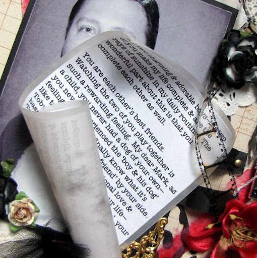
I once again used a scroll to hold my journaling. I first used a scroll to hold my journaling in my 'It All Began With A Promise' page.

I created the 'straps' that hold my journaling from 2 strips of strong card stock. The journaling itself is printed on plain white paper & then matted with vellum in order to give it the look of an actual scroll. The scroll itself measures approximately 3 3/4" x 6 3/4".
TIP: If you have a story to tell and don't want to take up too much room on your page--try using a scroll to hold your journaling. This also adds a unique embellishment to your page.

Here I'm displaying the scroll unrolled--as you can see you can store a good sized story, thoughts, poems, quotes etc. this way. NOTE: Remember to not obstruct your scroll once you decide where to put it on your page. You need to be able to slide your journaling out so always leave one side unobstructed.

Thanks for taking the time to visit! I hope you all have a fabulous Valentine's Day alongside your loved ones.
Photobucket

Saturday, February 4, 2012

Family Layout


Hello once again fellow scrappers! Today's page is a favorite of mine. I absolutely love this candid shot of myself with my two fave guys--my husband & my little fur-baby Toby.

I used papers by Kaisercraft's Chapter One collection. It coordinated perfectly with the colors in the photo itself. The colors also went just right for Case File #4 going on over at C.S.I. To create the inner frame--I cut a large triangular shape into my paper and then 'peeled' it back, rolled it once and just left the outer corner out. (I hope that makes sense!) Oh & prior to adhering everything down I inked all the edges to make them stand out more.

This is the challenge from C.S.I my page is based on.

This is a stamp by Stamp Enjoy. I further decorated the image with Stickles & inked the edges to make it stand out more.

I used Martha Stewart's Deco Flowers punch for the border. The edges were inked to allow them to stand out more. I further highlighted the border with dots of white opal liquid pearls.

The flourish chipboard frame seen here is by Dusty Attic. I painted it first with white acrylic paint & then heat embossed it with clear Star Dust embossing powder by Stampendous.

Another very cute stamp by Stamp Enjoy. The large spray is by Petaloo. It's one of their Color Me Crazy Sprays...I spritzed it with a teal glimmer mist so it would match my page.

The label holding my title is also by Dusty Attic. The label went through a couple extra steps in order to give it more texture. It was first painted with a teal/blue metallic acrylic paint. I then gave it a coat of clear crackle paint (Rock Candy). Once dry I lightly spread a bit of Frosted Lace Stickles on it with my finger. I added more Frosted Lace in the center of the label & spread it out thinner with my finger towards the edges. I next highlighted the edges of the label with Stickles and finished it up by adding two rhinestones.

Thanks to all of you who stop by for a visit and I hope you all have a fabulous weekend!
Photobucket