HOMEABOUT MERESUMETUTORIALSMY FAVES

Thursday, June 23, 2011

Precious Memories Layout


Good evening once again fellow scrappers & bloggers. Today's page is one I made for Stamp Enjoy as well as for a good friend & co-worker of mine. My friend has two little girls & I've already had the pleasure of scrapping one of them. Check out this little cutie here. I couldn't forget his other little girl in addition to the fact that her dad told me that she got a little pouty because there was no page for her. So here it is! Am hoping she likes it as much as her sister liked her page. :-)

As usual, I couldn't leave my stamps aside for this one even though the paper I used for my background came fairly decorated already. I further added to the background by adding some stamping, misting & Stickles.


A closeup of the misting & stamping. This clear butterfly is a stamp by Stamp Enjoy titled Butterfly in the Grass. I stamped it with StazOn black ink onto a piece of acrylic, cut it out & then colored in the wings with purple & Diamond Stickles. Tip: if you're planning on doing this technique, remember to add the glitter on the opposite side of where you stamped. When the glitter dries flip the image back around, adhere & you're done! I also added black Stickles to the body of the butterfly.

The heart seen here is also a stamp by Stamp Enjoy titled Heart Foliage.

The red cardstock seen behind the photo was dry embossed. I then sanded down the embossed image.

This rose stamp is a newly released stamp by Stamp Enjoy titled Roses. Just like the butterfly stamp--I stamped the rose onto acrylic paper with StazOn black ink, cut it out & decorated it with some Diamond Stickles.

The white border you see going around the picture is actually white acrylic paint that I tapped on with a stipple brush.

A closeup of the other rose stamp found towards the bottom of the page & more misting. By the way, I used Scarlet glimmer mist on this page.

Finally, a closeup of my second butterfly & the fence. The fence is made out of wood. I painted it with crimson red acrylic paint. Once it dried I spread Black Diamond Stickles all over it with my finger in order to give it a 'stone' type texture.

Other stamps used on this page are by Stampers Anonymous & Tattered Angels.

Thanks to all of you who take the time to stop by my blog...I appreciate it!

Photobucket


Wednesday, May 25, 2011

Reflection Layout


Good evening fellow scrappers! I was due for a Toby page & here he is! Admiring himself in the mirror. He does this a lot. Call him vain but he's always checking himself out. I was lucky enough to finally capture him doing this in a perfect angle.

This is a DT page for Stamp Enjoy. It showcases just a few of thier fabulous stamps which I think are excellent for making your own personalized backgrounds.

The majority of the chipboard is by Dusty Attic (except for the glitzy owl). In addition to the stamping; the background was spritzed with Olive Smooch & the edges inked with Burnt Sienna chalk ink.

I've used the Creative Scrappers sketch # 157 shown here. I just flipped the design...

Here's a closeup of the Dusty Attic brick chipboard. I used the Brick Texture technique on these chippies to give it that rustic look. You can find a brief tutorial on how to achieve this 'brick' look here.

A closeup of additional Dusty Attic chippies. For these, I painted them in white acrylic paint & then heat embossed them with Star Dust clear embossing powder. In real life, these chippies give off a beautiful glimmer!

I added a row of gold eyelets as a border. Am so grateful to my scrap buddy Natasha for making me realize the possibilities of eyelets! Till she came along, I thought they were only good for keeping the laces on my sneaks on tight...who would've thought eyelets could be used for so many other things!

I used Tim Holtz's Scrollwork die for the swirly border.

Here's my owl! This little guy is actually made out of wood. These wooden embellishments are from Scrap Desirs. They're thicker than regular chipboard & add fabulous dimension to your projects. I actually colored the branch with a permanent brown marker & then added clear iridescent glitter. I applied Martha Stewart brown leaf glitter to the owl itself. I used little yellow rhinestones for the owls' eyes & beak.

More Dusty Attic chipboard. This screen shot also shows one of Stamp Enjoy's stamps titled Border Corner 2. Quick Tip: to add more dimension to your stamping, accentuate the design with Stickles or glitter as shown here.

Here's another stamp by Stamp Enjoy. This one is titled Volutes et Ronds. As you can see I accentuated the stamps design by adding Stickles to it.

One more closeup of yet another Stamp Enjoy stamp. This one is called Lantern 1.

Before I wrap this post up--here are the Stamp Enjoy stamps I've used on my page.

Thanks to all of you who stop by. I appreciate you taking the time!

Photobucket


Monday, May 16, 2011

Be Unique Layout & Announcement


Good evening fellow scrappers & bloggers! I had momentarily lost my scrapping mojo for a bit there--but I blame work. Things have calmed down just enough for me to magically regain my mojo & it has come back with a vengeance!

Today's page is titled 'Be Unique'. This cute little brown eyed girl is actually the daughter of a good friend of mine. Gotta love those chubby cheeks & that fabulous smile!

The message I was giving this little one was to be yourself no matter what--to be a leader not a follower. That's the message I was trying to convey with the butterflies. Notice how all of them are the same except for one & it's the prettiest one out of them all. :-)

I did a lot of inking, misting & stamping on this one. I used a combination of Worn Lipstick & Shabby Shutters distress inks for the background along with Graphite glimmer mist. Pretty much all the stamps you see here are by Stamp Enjoy. Thier stamps are absolutely perfect for creating your own backgrounds.


Here's a closeup of one of Stamp Enjoy's texture stamps called Volutes et Ronds. In this shot you also see a bit of masking & a couple of the butterflies.

Here's a closeup of the lacing. After playing around with 2 strands of different colored ribbon for about 1 hour--I came up with this combination of lacing styles. I hope to soon post a tutorial on this lacing--if I can remember how I went about it! Mind you I was doing this lacing at about 1:30 in the morning...

The very pretty stick pin I bought from Mandy's (Craftysprinkles) Etsy store.

Here's a closeup of the transparent butterfly. The butterfly is an image that was printed on a transparency. I then added a bit of Stickles to the wings & glittered the body. I have a couple of diverse transparent or 'glass' butterflies in my small Etsy shop. These butterflies add a nice & unique touch to pages because of thier clear nature.

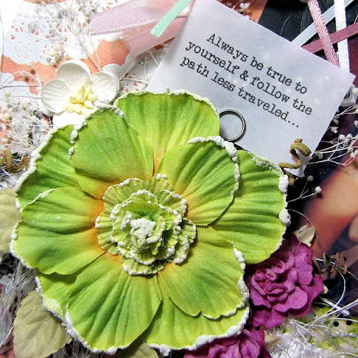
A close up of the large flower cluster & the journaling. I tucked a bit of baby's breath (a.k.a gyp) behind the large flower. Baby's breath adds such a delicate touch to girl themed pages.

Finally a closeup of another stamp by Stamp Enjoy. This one is called Cage 1.


Speaking of Stamp Enjoy--I have some fabulous news to share. I've been asked to be part of their DT & I'm so very happy to have accepted! I've used their stamps to create my own backgrounds for several of my pages & I love how you can create your own mini 'works of art' by combining thier stamps with inks & mists. I'm looking forward to utilizing thier stamps for many more creations.

Thanks to all of you who stop by & visit--I very much appreciate you taking the time.

Photobucket

Tuesday, April 26, 2011

It's No Fairy Tale Layout


Buenas tardes fellow scrappers! Today's page is a trip down memory lane for yours truly. Yep, that's me in the stroller some many moons ago. This page is actually a letter for my future child(ren). They say scrapbooking can be used to send letters to those that have passed & to those that are yet to come. So with this picture I've taken the opportunity to send a message to my 'to-be-child(ren)' regarding a very important lesson that I've already come to learn. Journaling reads as follows:

I know you don't currently exist & I'm not sure just when you'll arrive. What I do know is that I already have a message or you that I hope to pass onto you when the time comes. You'll refer to this piece of advice quite often in your journey called life.

Unfortunately, life is not a fairy tale. I've discovered that life is more like a storm--you'll find yourself basking in the sun one moment & then be shattered on the rocks the next--but it's what you do in those moments that you're shattered that defines you & makes you stronger. You'll have your ups & your downs--your laughs & your sorrows--& your own mistakes will be your best lessons. Yes, life is no fairy tale--but every second of every minute of every day is so very much worth living.

So I got a bit philosophical or maybe Shakespearean--but I base my advice on my own experience! Before I go on any further--just some tid bits on the supplies used on this page.


Once again I used a sketch from Creative Scrappers to design this page. All papers are from the Bittersweet collection by Basic Grey. I've had these papers just about forever & finally found the right page to use them on.

As usual I stamped the entire background--this seems to have become my 'must' technique on my pages lately. I used a combination of stamps. Here is a closeup of some stamping. The clock & circular texture designs in pink are stamps by Stamp Enjoy. The small script stamp is by Prima.

Other stamps used on this page are by Stampers Anonymous.

On this closeup you can also see the hand stitching I did along the borders of the page.


A closeup of the chipboard flourish. This chippie is by Maxine's Melange. To get the texture you see here, I first painted the chipboard in black acrylic paint. Then I heat embossed it with clear Star Dust embossing powder. In person, this flourish is very 'blingy'!

I added the title along some of the scrolls of the chippie.

A closeup of the flowers. The large dark pink flower is by Prima. The two smaller flowers were handmade by me. I refer them as 'frosted flowers' because the glaze on the vellum give them a frosty look. They were made with hand punches, vellum, inking & some glaze. To see a brief tutorial on how these flowers were made, please go here.

I tucked small white twigs of baby's breath (also known as gyp) underneath the flowers.


Finally a closeup of the lacing. This fabulous lacing technique is by my scrap buddy Natasha. I've been wanting to use her 'twisted lace' technique for a while now & this page gave me the perfect opportunity to do so. If interested in learning this lacing technique, please go to Natasha's post here. She did a great tutorial on this lacing technique. Thank you girl!

Thanks to all of you who stop by--I appreciate your visit so very much! Hope you didn't mind taking this brief trip down memory lane with me.
Photobucket

Frosted Flower Tutorial


Hello again fellow scrappers! This brief tutorial is on how to make the frosted flowers seen on my 'It's No Fairy Tale' page. The flower itself has most likely been done by several scrappers--I simply added a bit of glaze to the vellum. The glaze gives the vellum a 'frosty' look which is how these flowers got thier name.

Here's your basic list of supplies: flower punch, vellum, decorative scissors (optional), ink, paint brush, skewer or pencil for curling the petals, Triple Thick Glaze & glue.

Let's get started...

Tuesday, April 19, 2011

Bird Chaser Layout


Good evening once again fellow bloggers & scrappers. It's time for another Toby page! I saw the idea for this page in last months Creative Keepsakes magazine. I fail to remember by who it was--but the theme of the page dealt with her pup being a 'bird chaser'. That hit home run right away with my very own pup. Toby is a relentless bird chaser himself. Feathered friends? Not his apparently! No bird can invade his territory--he'll run after it like the wind!


Journaling reads as follows: Isn't this puppy cute? He's a little angel right? Well, photo 1 shows Toby's adorable & innocent face. Photo 2 is Toby after I've scolded him for chasing away the many birds that love hanging out in the backyard. It's not his fault really--he can't help himself! Thier endearing wings & that exhilirating chirping calls to him. He only wishes to play with them...is that really such a sin? My sweet little Toby, will you & birds ever be able to live together in harmony?


The design is based on sketch #151 from Creative Scrappers. I flipped it around to work with my photos & embellies. Lately, thier sketches have really been inspiring me...


As always I did some stamping on this page. I used a combination of Inkadinkado (Dots & Flourishes), Clear Art Stamps (Birdies), Tim Holtz (Birds on a Wire), Hero Arts (Old French Writing) & Prima. I also did some masking & stitching. In this screen shot you can see the zig-zag stitching along the border of both sides of the page.


I printed the journaling on plain white vellum. I inked the edges to make it stand out a little bit on the page.

The large tree branch & bird chippie is by Maxines Melange. The chippie went through a few steps to get the final texture I wanted. It was first inked in Vintage Photo distress ink. Then with my finger I spread some Vintage Photo distress stickles & a bit of Paprika stickles on it. Finally I put a bit of Frosted Lace stickles on the tips of some of the tree branches. The bird was painted in white acrylic paint, inked in Rusty Hinge distress ink, coated in copper perfect pearls & then embossed with clear UTEE (Ultra Thick Embossing Enamel).

Finally this pretty transparent black flower is also a stamp. This is a unique hand crafted petal stamp made by the talented Jessica. She's a fellow Etsy-er & I find her handcrafted stamps just fabulous for making my very own unique flowers. Here's the link to her shop--Green Garden Stamps & her blog: Garden Green Stamps Blog.

I stamped the petal stamp with Staz-On ink on a transparency, cut it out & then with a white gel pen I added white dots along the inside flower design. I then cut the petals in a bit more & bent them upwards for added dimension. I finalized the flower by adding a black Sultan Gem by Prima in the center.

I also tucked a bit of dried copper baby's breath--also known as gyp underneath my flower embellies.

Thanks to all of you who stop by my blog for a visit. I appreciate your time!

Photobucket

Brick Texture Tutorial


I've gotten a couple of inquiries on how I go about achieving that 'brick' look on the brick wall chipboard. Dusty Attic chippies that I've used on both my 'Frankie' & 'Brothers' pages.

I got this technique from Mr. Tim Holtz himself. I slightly altered his technique--but it's his idea that I used in order to achieve this particular texture.

Let's get started!

Monday, April 11, 2011

Frankie Layout

Hello once again fellow scrappers! Today's page is one that I've been meaning to do for quite some time. It's simply titled 'Frankie'. Frankie happens to be my best friend. Sure, it may seem odd that my best friend happens to be a man--but I guess that's what life had in store for me. Sometimes, you don't pick your friends--they pick you! That's exactly how it was w/me & Frankie. I have journaling on the back of this page--it tells how our friendship began: “Why are you eating lunch in your cube like a dork?” Believe it or not, this one question asked by Frankie on my first day of work, started a friendship that is going onto 12 years now.
Meet Frankie—my best friend. I met him in my first real job out of college back in 2000; good ol’ UPS. We’ve shared more laughs than I can even begin to remember & we’ve had our share of arguments as well. Through the years he’s become my ‘unofficial brother’. He brought me out of my shell at UPS, was there on my wedding day & nobody else has taught me so many useless phrases & terminology as he has!
He’s a great guy with a big heart though he doesn’t like to admit it. He can’t stand mustard or pickles & he can’t mix too many toppings on pizza or hotdogs—he’s a simple ‘meat & potatoes’ guy. He eats his candy bars with a fork & knife & is probably THE neatest guy I’ve ever met!?
He’s the Iceman (a nickname he gave himself), he’s Frank the Tank (his drinking nickname), he’s Frankie G. & don’t you forget it…
But to me, he’s simply Frankie—my brotha’ from another motha’ as he would say—my best friend as I would say…
The small quote in the metal trinket reads: "A real friend is one who walks in when the rest of the world walks out". He's single by the way--so if you knows of anybody that's into George Lopez look-a-likes--give me a shout! :-)


The page was based on Creative Scrappers sketch #150 shown here.  As usual, I did a lot of inking & stamping in the background. I used several stamps on the background by two manufacturers--Stamp Enjoy & Stampers Anonymous.

This fabulous tree chipboard is by Dusty Attic. I inked it in Aged Mahagony distress ink & then spread a combination of distress Stickles & regular Stickles to give it a variety of effects based on the lighting. It has Frosted Lace, Vintage Photo, Paprika & Diamond Stickles.


Here you can see some of the stamping in the background & of the net stitching that makes up the circle. I first saw this net stitching on one of Irene Tan's pages (Scrapperlicous). For this page, I did what I consider half of a net stitch since I only went one way & didn't come back the other way to create a criss cross pattern.


I've used some leftover brick chippies from my 'Brothers' page here. This chipboard is also by Dusty Attic. Here, the chipboard has been inked & embossed in Vintage Photo. I further decorated the bricks by adding Vintage Photo Distressed stickles with my finger.  I have a tutorial on how I gave the brick chipboard it's texture here.


Finally, a close-up of the large flower. The sanded cardstock is by Core'dinations.

Thanks to all who take the time to stop by--I appreciate your stopping by. I also hope this page inspires some of you to scrap your friends along with your family. Sometimes we concentrate so much on family--that we oversee our friends. I believe true friends come in very small numbers--if you're lucky enough to find one, make sure you make the time to pay them a small tribute. It'll be just one more memory to smile about in the years to come.
Photobucket

Wednesday, March 30, 2011

New York Layout


Hello again fellow scrappers! Today's page is one that I've been meaning to scrap for ages--yeah--none of us knows what that's like right? :-) When I saw sketch #149 over at Creative Scrappers; that light bulb just went off! It was perfect to showcase this trip my husband & I took back in 2006 to NYC. He had never been to the top of the Empire State building--meanwhile I had been there about 20 times--so I was the one to take him for the very first time. The picture is us at the very top of the Empire--you can see New York behind us. Gorgeous view! I absolutely LOVE the city--all the small pics you see were all taken by me during different trips into the city or from New Jersey.

Once again I did a lot of stamping. The script you see in the background is part of the paper but everything else was stamped. I take much of my stamping inspiration from Irene also known as Scrapperlicious. I love her stamping--to me she creates works of art with her stamping. I did some stitching & misting. I also finally got to use those fragments by Tim Holtz that I've had in my stash forever. I thought they would showcase my NYC pictures really well.

This is the Creative Scrappers sketch I based this page on.

This flourish is actually not chipboard--it's made out of wood. I found this small company over in France called Scrap Désirs that sells all sorts of very cute wooden embellishments! I found them to be very unique. For this flourish I simply covered it in three colors of fine glitter--dark brown, light & dark turquoise.

A close-up of the large transparent flower. This is actually a different take on the glass flowers I displayed here in my blog not too long ago. If interested in making this flower please go here. The only difference is that I alcohol inked the flower in Butterscotch & a touch of Bronze & then stamped on it with a script stamp with black StazOn ink. Whenever stamping on transparencies--always use permanent ink such as StazOn. Any other ink will smear.

A close up of the Tim Holtz fragments. I also stamped on some of the fragments. The stitched dark brown frame was made with a Martha Stewart punch around the page titled Cherish. This punch begs to be stitched. It takes two seconds before eternity to do--but it's worth it for the effect. I thank my scrap buddy Natasha for being a stitching fanatic! She always stitches around the border whenever she uses this punch & it's so very much worth it!

Finally, a closeup of the stamped city & title. This city stamp is by Stampers Anonymous Tim Holtz collection titled Cityscape. I used a combination of Stampers Anonymous stamps (mainly from the Tim Holtz collection) & Stamp Enjoy.

Thanks to all of you who take the time to stop by my blog. I appreciate your visit so very much!
Photobucket