HOMEABOUT MERESUMETUTORIALSMY FAVES

Thursday, June 21, 2012

You & Me Layout

Hello once again fellow scrappers! Today's page is one that I made several months ago. In fact it was in November of 2011 I believe. This was a page I made for C'est Magnifique kits when I guest designed for them. The November kit was used for this page. This would be me & my husband on our vacation to Puerto Rico last year. I kept the page fairly simple--I was concentrating more on the photo and the fabulous view we had in the background.

The birds and some of the flowers are from a 'songbird' Prima Marketing vine that I ripped apart. :-) Doesn't sound pleasant but sometimes you have to improvise! I curled one of the corners by using several coordinating scraps. I would just cut the corners and adhere them one behind the other--and finally just curl them. This gives the effect of having several pieces of paper together when in fact it's just the corner with several pieces of paper. By the way, just about everything seen on this page came with the kit. I believe just a few of the scraps I used in the corner and the thread I used for the sewing were not part of the kit. I used a Martha Stewart punch around the page for the edges of the page.
 The edges were inked with a bit of Marmalade distress ink by Tim Holtz to make them stand out a bit more. I hand stitched all around the border with some thread from my stash. The letters used in the title were plain white corrugated cardboard. They were inked & spritzed in shades of yellow, orange & brown. I then tied a bit of the thread I used for my stitching around a few of the letters in the title.

Several of the papers in the kit came with designs that lent themselves for fussy cutting. The green cluster of leaves seen here were cut from one of the papers in the kit. I then added clear stickles on several of my cut pieces in order to further decorate them. Thanks to all of you who stop by for a visit! Enjoy the rest of the week...

Photobucket

Saturday, June 16, 2012

Chickadee Altered Picture Frame

Hello again fellow scrap peeps! Today I'm posting yet another picture frame that I altered many moons ago--but never got the chance to display here on my blog.

This is actually a plain wooden circular picture frame that I bought at my local Michaels that I altered. I used pink paper by Basic Grey plus beads, vines, fabric flowers & mulberry flowers from my stash.  The chickadees are actually a stamp that I colored in & then carefully cut out.  All of the edges are inked with Tea Dye distress ink by Tim Holtz.

I actually sold this picture frame in my Etsy shop some time last year.


Here's a closeup of the stamped cluster of chickadees at the bottom. I colored them in with Prismacolor markers and then added a bit of Star Dust stickles to further decorate each chickadee.

The fabric flowers & beads are actually pieces that I pulled apart from a larger cluster of flowers.  You can find these at any local arts & crafts store.  Sometimes I find them on clearance and purchase them with the intention of pulling them apart in order to decorate frames or boxes & even layouts.  I randomly added mulberry flowers here & there to further embellish my frame.

Thanks for stopping by & enjoy the rest of the week!
Photobucket

Wednesday, June 6, 2012

Once Upon A Sketch Design Team!

Just wanted to quickly share the latest news.  I've been asked to join the 2012-2013 Once Upon A Sketch Design Team!  Yay!!

Am very honored & humbled to be a part of such a talented group of ladies.  A big thank you goes to Nadia for giving me such a great opportunity!

Just check out the fabulous talent that I'll have the pleasure in working with:

Jeni O'Connor -Administrator (Australia /Canada)
Georgia Heald - Guest Designer coordinator (Australia)
Patti Hamil - Sponsorship Administrator(USA)
Eila Sandberg (Sweden)
Efi Stamatelli (Greece)
Erin Blegen ( USA)
Romy Veul (The Netherlands)
Vicky Alberto (Canada)
Luzma Bruna (Chile)
Solange Marques (Brazil)
Evgenia Petzer (South Africa) 
Renata Moni (Brazil)
Melenia Agapides (Greece) 
Cathy Cafun (Australia) 
Kim Jeffress (Australia)
Florence Teixeira - (France)
Helena Virpi (Italy)
Hilde Aaslund (Norway) 
YAY! ----> Kay Fatula (USA)
Camilla Ekman (Sweden)
Svetlana Austin (South Africa)

To see the full announcement, click here.

Am looking very much forward to working with this great team!  What a great creative journey this will be...
 
Photobucket

Saturday, June 2, 2012

Altered Shabby Chic Picture Frame


Good evening fellow scrappers!  This is an altered wooden picture frame that I made a few months ago.  It was actually a Christmas present for a good friend.

The wooden picture frame was purchased at my local Michaels.  Amazing how one can turn a simple frame into your very own personal 'artsy' masterpiece!
The vine is by Prima.  I added additional flowers from my own stash here and there in order to make it into a fuller vine.  The mushroom bird, large green fabric flower & small white wooden fence is also from my stash.  The glass vial is by Tim Holtz.  I filled the glass vial with small black beads from my stash and tied a bit of twine around it.
A sheer white ribbon was added at the top of the frame.  I used a bit of hot glue to adhere the ribbon and to add the loops in order to give it more dimension.

I used a bit of iridescent light green garland from my stash to decorate the border of the inner frame.
The background was first painted with white acrylic paint.  Then I added a layer of clear crackle paint that I purchased at my local Michaels.  Once dry--I added a third layer of fuchsia acrylic paint.  As the fuchsia paint dried it 'crackled' and revealed the white paint beneath.  Neat effect huh?

The random script seen throughout the frame is actually a stamp by Donna Salazar titled 'All My Love'.   I stamped the image on a transparency with black Staz On ink.  I then cut out the stamped image & adhered it randomly on my frame with clear dry glue.

The crystal flourish is by Prima.  I cut it out of the original packaging & adhered it with clear drying glue.

Another closeup of the floral arrangement.

Thanks to all of you who stop by for a visit!  Your time is always very much appreciated.
Photobucket

Tuesday, May 15, 2012

Scroll Journaling Tutorial

Good evening fellow scrappers!

Lately in several of my layouts I've incorporated my journaling in the form of a scroll.  It's great for when you have lengthy journaling or a story to tell with your page & don't want to take up too much room or simply don't have the room.  It also makes for a unique embellishment to go along with your page.

I've been asked by a few to create a tutorial on how I go about making this scroll journaling--so here it is!

Saturday, April 28, 2012

Home Is Where The Heart Is Layout


Hello once again fellow bloggers & scrappers!  Today's page is one I'm submitting for the April challenge going on over at Once Upon A Sketch (OAUS).  The theme of the challenge is 'home'--to scrap however you'd like to interpret what 'home' means to you.

So here's my interpretation of both Nadia's sketch that she provides along with the challenge & the theme of 'home'. To me, home is my husband & my little fur-baby Toby.  Wherever these two are--that's my home.  They provide all the comfort & love I need.

I used papers & a couple of embellishments from the April kit by C'est Magnifique.  Most of the papers are by the ScrapCake.
Here's the sketch Nadia provided for this month's challenge.
My journaling is tucked away in the form of a tag.  The cute tag along with the envelope are embellishments that came with the C'est Magnifique kit.  I added a bit of tulle to the tag & inked it's edges with Tea Dye distress ink.
The rhinestone flourish is by Prima.  I left the flourish adhered to the transparency it comes packaged in.  I simply cut around it.  TIP:  If you want to add flourishes on top of bulky layers of paper or other embellishments, leave them adhered to the transparency they come on & just cut the flourish out.  This way you can place the flourish just about anywhere on your page.

The splatters seen randomly around my page are stamps.  I bought this 'splatter' stamp set at my local Michaels.  The set is by Recollections & I use it frequently on my pages.
The hearts are a combination of a Fiskars heart punch and a Spellbinders Nestabilities heart die.  I hand sewn along the center of each heart in order to lift either side up & give the page a bit more dimension.

The edges of the page were all distressed with my Zutter Distrezz-It-All then lightly inked with Tea Dye distress ink.
This wooden sign is by Kaisercraft & also came with the kit.  I painted it with yellow acrylic paint & then heat embossed it with Star Dust transparent embossing powder by Stampendous.  I added 3 dots of Liquid Pearls on either side of the sign to further decorate it.
The floral cluster is a combination of mulberry, resin & fabric flowers.  The two large light pink/yellow mulberry flowers came with the kit.  The two small yellow flowers are from my own stash.  The large purple flower is by Prima & the resin flowers are by Webster's Pages.
The chippie frame is by Dusty Attic.  I treated the frame the same way I treated the wooden post.  I really like the shimmer that the Star Dust embossing powder adds.  In person, items treated with this kind of transparent embossing powder really give off a nice shimmer & adds lots of texture/dimension to your pages.

The cute little mushroom bird is from my stash.  I have several of these & love tucking them around my pages!

Thanks to all of you who stop by for a visit!  May you all have a great weekend!
Photobucket

Monday, April 23, 2012

Look Within Yourself Layout BITW Guest Designer

Good evening fellow scrappers!  Today I'm sharing a page that I made for the latest challenge going on over at Bird Is The Word (BITW).

I was given the opportunity to guest design for them & I'm very grateful for the chance!  Thank you again Wendy.

I received an either/or challenge. I had to use either the word 'Look' or 'See'.  As you can tell from my title...I went with 'Look'.

I went back to one of my original & fave scrapbook styles which is grungy.  This young guy is actually a co-worker/friend of mine.  He's a sweetheart & has a heart of gold--all he has to do is believe a little bit more in his own capabilities.  So when I rec'd this challenge the first phrase that popped into my head was 'Look Within Yourself' and followed closely by that was my co-worker.  The piece of advice I'm giving him is in the journaling/title which reads: To find the answers to your questions...If searching for the strength to push ahead...When seeking for a reason to smile...Simply Look Within Yourself


I did much distressing, ripping & wrinkling on this page.  The edges of the page were distressed with my Zutter Distrezz-It-All.

TIP: To create the large wrinkle effects shown in this close up--first wet the paper with water.  I have a 2 oz mister bottle by Ranger that does a great job at wetting the paper just right for this kind of technique.  Once the paper is wet simply wrinkle it up with your own fingers.  Don't be afraid to scrunch away.  Once you get the wrinkles just how you want them take a heat gun to it & dry it up.  The paper dries wrinkled & stays that way.
The chippie is by Dusty Attic.  I left it raw for this page--meaning I didn't ink or paint it.  All I did was heat emboss it with some Star Dust transparent embossing powder by Stampendous & added a couple of rhinestones to further decorate it.
The clock was cut with Tim Holtz's die called Weathered Clock & grungeboard.  I then inked it with a medium coat of molding paste and randomly spread a bit of gold embossing powder & Fake Bake Enamelz by Shimmerz.  Then I took my heat gun to it & heat embossed it.  By using the molding paste the embossing powders dry with a much more 'puffier' texture which I really enjoy on masculine pages.
A closeup of the journaling & the metal flowers.

Journaling was printed on vellum from my computer & then manually ripped out.  The rest of the title was done with my Dymo Caption Maker & letters from my stash.

The flowers are a combination of metal mesh & mulberry flowers.  I have thin metal mesh in my stash that I used with my Big Shot & the Tattered Floral die by Tim Holtz.  To define the petals of the metal flowers I added a bit of puffy paint to the edges & heat set them.
I printed the photo four times & randomly layered them.  The photo is matted with scraps of paper that I manually & randomly ripped.  I also tucked a bit of burlap in either corner.

Here you can also see the large metal mesh flower that I combined with aluminum foil.  The aluminum foil layer of the flower was made by utilizing the same technique I showed in my 'Faux Metal & Acrylic Flower' tutorial.  You can find that tutorial here.  Only difference is that for this photo I did not incorporate any acrylic.

Thanks to all of you who stop by for a visit.  Your time is always greatly appreciated.  Do feel free to stop by BITW & check out their challenges.
Photobucket

Friday, April 6, 2012

The Beauty Within Layout

Good evening fellow scrappers!  Time for another reveal over at Color Combos Galore (CCG).  The challenge for this inspiration was to use frames or framed objects to draw focus to elements on the page.  Based on this, I used a chipboard frame by Dusty Attic to frame my photo. This is me sitting on a beach in El Dorado Puerto Rico last September. My page is based on how I was finally able to make peace with myself--how I'm content with both the inside as well as the outside. A few years ago I never would've scrapped a photo of me in my bathing suit.  Now I can & am content I did!  The journey to loving yourself completely can sometimes be a long one.  But when you reach the end of that journey--it's a very fulfilling feeling.

Here's the CCG challenge with all the details.

I once again did my journaling in the form of a scroll.  Am getting very fond of this form of journaling b/c I can write a lot & at the same time add a unique embellishment to my page.

Here's the scroll rolled open.

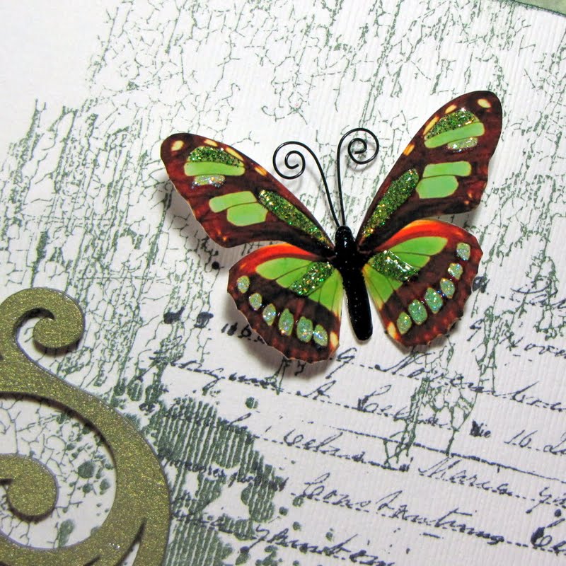
The butterflies are from my Etsy shop.  I have a variety of different butterflies in my small shop.  If interested--feel free to pay my shop a visit here.

I also did some stamping in the background.  It's a combination of a crackle stamp by Donna Salazar, script stamp by Unity Stamps & splatter stamps by Recollections.


Here you can see my scroll journaling tucked in it's resting place.  The makeshift 'straps' are made out of sturdy card stock.  The journaling is printed on vellum.

I combined several embellies to make up the the cluster of flowers going along the side.  I used a rhinestone vine & flower vine by Prima and a couple of ribbon, mulberry & beaded flowers from my stash.


For the chipboard frame it was first painted with a light green acrylic paint then covered with a semi-thick layer of crackle paint.

I used my Dymo caption maker for part of my title.  This is the first time I incorporate a banner into my page--I thought it fit this page & served as a holding place for part of my title.
More embellies mixed in within my cluster of bits & bobs.  The resin cabachons are by Websters Pages and the little nest with eggs is by Prima.

Thanks to all of you who stop by for a visit.  Do remember to swing by the CCG blog to see the other DT's take on this challenge & to play along!

Photobucket

Monday, March 19, 2012

The Boy Within Layout


Good evening fellow scrappers! It's time for a new challenge over at Color Combos Galore (CCG). The inspirational challenge was to scrap an incredible kid in your life--the designer's challenge was to journal about what makes your chosen child so incredible.

Well at first, this posted a bit of a challenge for me since me & the hubby do not have kiddies of our own yet. Then when I started thinking about it--we're pretty kiddie free! None of our close friends have kids yet & the few kids we do mingle with we do so on only very rare occasions. So I thought a bit 'outside of the box' as they say & scrapped the inner boy living within my husband.

So this is him at approximately 11 years of age. The middle photo is him today. My husband is still very much a kid at heart & that little boy still lives very much within him. My journaling focused on how keeping 'the boy within' a live has kept him young at heart & even a little innocent/naive at times.

Here's the color palette my page is based on. The various hues of browns/tans with a splash of blue just screamed 'boy' to me. So I knew it had to lean more towards a masculine page.
The photos are matted with some Tim Holtz glassine that I wrinkled up & then randomly inked with Walnut distress ink--a bit of torn up corrugated cardboard that I spritzed with some light brown glimmer mist and inked the edges with some dark brown chalk ink and a bit of cheese cloth.

The crochet doily is from my stash. I tucked a small glass vial full of blue beads from my stash. The black flourish is a stamp. I stamped the image on a transparency with black Staz On--cut out the image & then adhered as shown.

The ticket behind the large brown flower is by Tim Holtz. There's also just a bit of brown tulle peeking out from behind the large flower to slightly soften the page. The brown beaded vine is by Prima. It was one vine that I cut into two pieces.

The film strip is also by Tim Holtz. I gave it a small loop on top for a bit of added dimension.

The journaling is tucked behind the first photo on top and keep it in place with a Tim Holtz clip.

The pen nib is also by Tim Holtz & the old fashioned car is a glimmer glass by Tattered Angels.

I based the overall design of my page on a sketch by Nadia Cannizzo. This sketch is being used for the March sketch challenge going on over at C'est Magnifique.

Thanks to all of you who stop by for a visit. Do swing by the CCG blog and check out the other talented DT's take on this challenge & to play along if you can!
Photobucket