HOMEABOUT MERESUMETUTORIALSMY FAVES

Tuesday, December 14, 2010

The Christmas Money Shot Layout


Happy Holidays fellow scrappers & bloggers! Tis the season right? Tis the season for stressing, Christmas pictures, Christmas cards, Christmas music, gift shopping & oh yes--stressing!

This layout is about one of my Christmas traditions which is the annual picture my husband, myself & Toby take in front of the Christmas tree for the holiday cards. As always it took about 24 tries in order to get that perfect shot. Basically the perfect shot is when all three of us are actually looking at the camera. Getting Toby to stare at the camera at the right moment is a task in itself. The three pictures in a row are just a few of the many 'no good' shots taken. The full colored picture is the Christmas Money Shot & it's the actual photo I used for this year's Christmas cards. The journaling tag is behind the title & the poinsettia embellishments. Journaling reads as follows: Every Christmas it's the same routine--two dozen or more pictures taken by the tree. An endless quest, a serach for the Holy Grail, hoping & dreaming that Toby will actually look at the camera at that exact moment the picture is taken. It's like winning the lotto when we finally get the perfect Christmas money shot!
I did a sort of 'staggered' lacing & once again have used eyelets on my page! Thank you Natasha for having me discover the wonderful world of eyelets *wink*. I distressed half of my page & then tucked a thin layer of multi-colored tinsel under the distressed border. This tinsel was from my own stash.

I mainly used the Swirlydoos December kit for this page. Only a few handmade embellishments are from my own stash.
An example of this are the transparent holiday ornaments seen on this page. For a tutorial on how these ornaments were made please go here.
Behind the ornaments I did some masking. I used a flourish mask from Layers of Color & used Forest Moss distress ink. The soft script print you see here was actually a stamp. I used gray ink instead of black because I wanted a subtle script displaying behind the masking & the ornaments.
The tinseled snowy frame seen in this closeup is also something new I tried in order to give my picture a unique holiday frame. If interested on a tutorial on this tinseled snowy frame please go here.


The Christmas butterflies are embellishments from my Etsy shop. If you like them, I made a few extra sets & are currently found in my shop. Feel free to drop by if interested!


Finally here's a closeup of the faux metal & acrylic poinsettia embellishment. I made a brief tutorial for this as well. If interested, please go here. I tucked both the journaling & my title behind this embellishment.
Thank you for stopping by & for visiting! I'm just so very happy that I was able to make a Christmas page in December & not in July which is how it usually works for me!
Stay warm...till my next post...
Photobucket

Faux Metal & Acrylic Poinsettia Tutorial


In this tutorial I'll be showing how I went about making the faux metal & acrylic poinsettia embellishment seen in 'The Christmas Money Shot' layout. I learned this technique from my local scrapbook store on a class I attended.

I completely improvised as I went along for this embellishment which is why I don't have a picture of my list of supplies. I kept adding & changing as I went. This is the list of supplies I finally ended up using: Sizzix die cut, aluminum foil, diamond dust, acrylic or transparency, sturdy scrap paper or grunge board, embossing folder, Big Shot or any other compatible die cut machine, brush, white acrylic paint, scissors, gold stamens or any other suitable item that you'd like to use for the center of the poinsettia, Staz-On black ink, foam pop up dots, glue stick & a partridge in a pear tree! Sorry, had to throw that in there--nix the partridge--whatever that is--I'm guessing it's some kind of bird? Let's get started before I get more sidetracked...

Snowy Tinseled Frame Tutorial


Hello again fellow scrappers! In this tutorial I'll be showing how I went about making the snowy tinseled frame seen in 'The Christmas Money Shot' page.

My goal was to make the effect of an 'icy' snowed in frame. I'm just glad I finally got to use one of those Martha Stewart tinsels that I've had in my stash since about forever!

Here are your basic list of supplies: Two sided tape (I use the Sookwang brand tape that came with my Scor-Pal, it is 1/4" of an inch wide), Diamond Dust, tinsel, brush & snow texture (if you don't have snow texture, white acrylic paint will work as well).

Holiday Ornaments Tutorial


This tutorial shows how I went about making the holiday ornaments seen in 'The Christmas Money Shot' layout.

Tuesday, November 30, 2010

Spider Lacing Tutorial

This tutorial will show how I went about making the 'spider lacing' seen in my 'My Little Pirate' layout. As always, I'm sure a talented scrapper out there has done this already but this just shows how I went about getting this particular lacing done. I named this lacing 'spider lacing' because I was making a Halloween themed layout & wanted the lacing to have kind of a 'cobweb' look to it--that's about the extent to my reasoning behind the name!  :-)
You can space your holes in any way--although I tend to keep mine no more than 1" inch to 1 1/4" inches apart. You can also take all the measurement guess work out of the way by simply using a border punch to get the holes all evenly spaced out. For this layout I used Martha Stewarts Scallop Dot punch. I then inserted black eyelets into the holes with my Crop-a-dile.

Monday, September 20, 2010

Dogwood Flower Tutorial

Hello again fellow scrappers & bloggers. I have a brief tutorial today that's been hanging around in 'draft' mode in my blog for months. I've known how to make these dogwood flowers for a while now & have never gotten around to posting a tutorial...well, here it is!

They're really easy to do. All you need is a balloon punch (I'm using the balloon punch by Martha Stewart), a marker, a 1/4 inch hole puncher, 1/2 inch glue dots, Stickles, 1/2 inch circle punch, a mouse pad, shaping tool & any kind of sun punch for the center of the flower. I'm using sun punches in 2 different sizes by the Punch Bunch. If you do not have a sun punch you can also use floral sprays/stems if you have them.

Thursday, September 2, 2010

Curled Frame Tutorial


I've seen several scrappers do layouts where they roll pieces of paper on thier layouts. I recently tried this technique out myself by using rolled paper as part of a frame.

This tutorial shows how to make the curled frame I used in this layout. As always, I'm sure this has been done before since there are just so many talented scrappers out there. I'm simply showing my take on this curled frame.

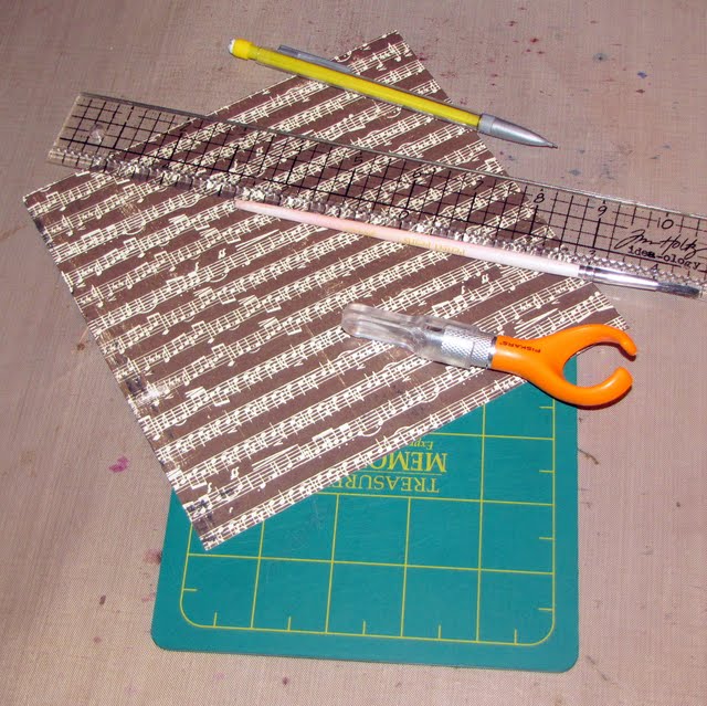
Here are the supplies you'll need. A paper cutter--I use the finger cutter by Fiskars. I've had several paper cutters & this has been the best one for me by far. I use my finger to guide the point of the knife so I have really good control of where I'm cutting. Some cardstock or patterned paper. If using patterned paper--it's most likely best if you use double-sided paper so that when you curl the paper it doesn't display in a plain white color. This of course, is all based on preference. If you want it to be white, then that's alright too! A cutting mat. A ruler, pencil & a paintbrush. I use the handle of the paintbrush to curl my paper--but you can use a pencil too. Ok, let's get started!

Tuesday, August 17, 2010

Outlaw Layout


Hello again fellow bloggers & scrappers! I bring you today my latest layout titled 'Outlaw'. This is a completely 'rugged' masculine layout that I'm actually very proud of!
This is my husband decked out as a cowboy. We did this photo shoot a few years ago where we both dressed up as old western figures. In this picture he's giving us his 'mean' look. That's about as mean as he gets folks! :-) I found this picture while rearranging my photos & felt compelled to scrap it. When I showed it to my husband he was pleased. He said the layout was very 'manly'--just like him. You just gotta love him!
This layout is 99% Tim Holtz. Everything from the paper to all the embellishments is by him. Only the cardboard that's in the background & the stamps which are by Graphic 45 are not by him. I used lots of techniques here--misting, inking, distressing & a technique I called 'burnt edges' where I made the edges of my layout & photo mats look burnt. I have a brief tutorial on this technique found here. I'm sure someone out there has done this already--but the tutorial simply shows how I went about doing it. I was very pleased with the results. I also used several tips & tricks from the man himself throughout the layout.

Here's a closeup of some of the stamping I did & the cardboard. The cardboard I misted in Suede Glimmer Mist & Olive Green Smooch. I pretty much drowned the cardboard in both of these mists & then let it air dry.


I used the clock mask by Tim Holtz to mask the big clock & randomly spread some Th gears & cogs around the clock & behind the photo mats.


The flourish is grungeboard. I first embossed it with Vintage Photo Distress Embossing powder. Then with my fingers I removed a little bit of the embossing powder to reveal the grunge board below. Next I inked it with Vintage Photo distress ink. Finally I spread some Rock Stickles crackle paint on it & this was the end result. In person, it looks as if it's rusted. This technique I got from reading Tim Holtz's blog. It's also in his last book 'A Compendium of Curiosities'.
I used four TH hitch fasteners & a TH ball chain to go around the border of my picture. I just wrapped the ball chain around the fasteners & secured with a connector. I hung the two tokens from a TH Swivel Clasp that is also hanging from one of the fasteners.

The rest of the embellies are also little items from TH. The Bingo card & the calendar I got from TH's Lost & Found Paper Stash.
The title is housed in a TH ornate plate. Talk about over-dosing on TH products?!
The title itself I printed from my computer. I then put some Glossy Accents ontop of the title & let it dry. This gives it a dimensional raised enamel effect.
Well that's it for today...thanks for stopping by & as always comments are very much appreciated!
Photobucket

Burnt Edges Tutorial


Here I am with the burnt edges tutorial as seen in my layout 'Outlaw'. As already mentioned...this technique has most likely been used before--I'm simply showing how I went about getting this burnt look.
Prepare to get messy with this one. It's all about using your fingers with ink, glimmer mist & water.

Here are your basic supplies. Paper, dark brown glimmer mist. I used Suede Glimmer Mist. Dark brown ink. I'm using chalk ink in a Dark Brown color. I use chalk ink because this ink smears a little with water. You can also use a Walnut Stain Distress ink for this since Distress inks also react well to water. A mini mister or any kind of spray bottle & a Tim Holtz distresser. If you do not have this little gadget, running the edge of a sharp pair of scissors along the border of the paper works good too. Heat gun (not pictured).

Monday, May 24, 2010

Spiral Flower Tutorial


Good evening fellow bloggers! Today I'm going to take a few minutes to post a quick tutorial on how to make spiral flowers. I recently learned how to do this in a class I took at my local scrapbook store. During this class I made my very first canvas! I'll be posting this soon because I'm very proud of how it came out! These spiral flowers were part of the canvas. They're so very simple to make but yet make such a great statement on layouts, canvases, cards etc...In addition, I found that making these flowers is an excellent way to get rid of scraps!

So let's get started.