HOMEABOUT MERESUMETUTORIALSMY FAVES
Showing posts with label Sketchabilities DT. Show all posts

Friday, December 30, 2011

My Joy Layout


Good morning fellow scrappers! Hope all of you had a fabulous Holiday. Now onto the final countdown of 2011. Um, where DID this year go? Can someone let me know!?

Along with the end of 2011 comes my end with Sketchabilities. This will be my final post with them. I had a great time while on this DT. The sketches were a great challenge for me & pushed those creative juices.

I did a Christmas page for this sketch. Tis the season right? I took this very cute candid shot of my hubby & fur baby Toby while doing our annual Christmas card photo shoot. This photo worked just right for this sketch & my overall Christmas theme.

I used one of the December scrapbook kits by a very cute Etsy shop by the name of Funtoolas. This particular kit contained the lovely papers 'Waiting for Santa II' by Pion Design.

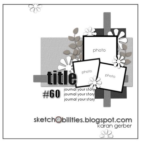
Here's the sketch my page is based on. Karan comes up with some very versatile sketches--they can be interpreted in many ways & they kick your creative skills into high gear. :-)

I used a brick mask by Prima for the background. For my inking, I used Aged Mahogany & Chipped Sapphire distress inks.

The snowflakes are actually Christmas tree ornaments that I found at my local Target for $1.00. They come in packs of three, are light, flat & fit perfectly on scrapbook pages. You can also use snowflake dies--I just don't have any--so I ended up using these ornaments instead.

The Santa tag is a cut out from one of the Pion papers. I distressed & inked the edges.

This very elegant metal embellishment came with the Funtoolas kit.

I used a scrap of glassine paper by Tim Holtz to mat my photo. I just wrinkled the glassine several times & then swiped some Walnut Stain distress ink over the wrinkled glassine. I'm loving this glassine paper! My next newfound love is cheese cloth which I've used to mat my photo as well.

The title 'My Joy' is a combination of a transparent label made with my Dymo label maker & some American Craft Thickers that came with the kit. I wanted my titled to be in a certain position on my page. It didn't quite fit on my photo & there was too much of a gap between the photo & my background where even if I adhered my title with pop dots--half my letters would be distorted. The solution? Transparencies! TIP: Adhere your title onto acrylic or transparency. Then simply cut it out. This way you can place your title anywhere--like one large sticker without distorting it. This works great for pages with lots of dimension--and as you can see from my photo--it's really not noticeable at all. The title almost looks like it's floating on it's own. Magic I say!

I did a few random tears into my page. I then punched out small scraps with my Martha Stewart Wildflowers punch around the page deep edge punch. These scraps I tucked behind my tears. I then added one safety pin to each of my tears.

Finally a close up of some of my stamping. I can't have a page without at least one stamp in it! The splatters is a stamp by Recollections and I believe it's called just that 'Splatters'. I bought it at my local Michaels. The script stamp is by Donna Salazar & is called 'All My Love'.

Thanks to all of you who stop by for a visit. I'm always grateful to you. Feel free to hop on over to the Sketchabilities blog to see the other DT's take on this sketch & to play along if you can!

May you all have a wonderful, happy & safe New Year!

I'll be back in 2012...
Photobucket

Thursday, December 15, 2011

Love Cake Layout


Good morning fellow scrappers & bloggers! It's time for another sketch over at Sketchabilities!

This is me & my husband on our wedding day. These photos were taken during the cake cutting. Our DJ referred to the cake as our 'love cake'. As I was scrapping this I remembered that specific comment & therefore his comment became the title for this page.

Here's the fabulous sketch by Karan this page is based on. I enjoyed working with circles instead of the usual squares or rectangles--I love it when sketches take me away from what I'm 'comfy' with. It makes me take my creativity one notch higher.

A close up of one of the flourish chippies. These are made by Dusty Attic. The chippies were painted with a deep burnt orange acrylic paint. Once dry I inked them with embossing ink & heat embossed them with Star Dust transparent embossing powder by Stampendous. In person, they give off a very shimmery effect.

The resin window is by Prima. Here you can also see a bit of the hand stitching I did going around the circle. This particular stitching I saw over on Irene Tan's blog--better known as Scrapperlicious. She refers to it as the long stitch technique. In order to get that zig zag pattern the stitches are all done in a very long angle. Next time I do this stitch I'll do a brief tutorial on it for those who are interested.

Here's me & my hubby cutting the cake & posing for the camera at the same time. :-) The colorful circle behind us is by Pink Paislee (Mistables). I inked it with a few distress inks (Stormy Weather, Mustard Seed & Wild Honey) then spritzed it once with Suede glimmer mist.

A close up of the second smaller photo. Both frames for my photos is also by Pink Paislee.

Thanks to all of you who stop by for a visit--it's always very much appreciated!

Don't forget to stop by the Sketchabilities blog & check out the other talented DT's take on this sketch & do play along if you can!
Photobucket

Wednesday, November 30, 2011

Girl In The Mirror Layout


Good morning fellow bloggers! It's reveal day over at Sketchabilities.

For this one, I dug deep into my mom's box of photos that she cherishes so much. Within that little treasure box I found this photo of yours truly when I was approximately 2 years old. Yep, that's me--looking at myself in the mirror. My mom said that this is one of her favorite photos of me. She said that when little I used to look & talk to myself a lot in the mirror. Apparently yet another 'only child' syndrome!? I no longer talk to myself in the mirror...although I'll still have the occasional conversation with one or two of my stuffed teddy bears! :-) Kidding guys...but when little I did actually talk to myself in the mirror & yes, I did apparently have detailed conversations with my stuffed toys. My mom claims it's because I was an only child. I think it's a combination of that and a very active imagination (which I still do have). Who knows? But here I am in one of my 'mirror' moments.

I've used papers from Bo Bunny's Crazy Love collection. Now, I rarely get to scrap 'girly pages'...so this was a real treat for me.

Here's the fabulous sketch provided by Karan. I am loving these multi-photo layouts. For a very long time I had done only 1 photo layouts...so this has polished up my multi-photo/element skills.

I have tucked a small tag within the strips of paper. I plan on adding a bit of journaling to this tag. I just haven't decided exactly what I'm going to say. I liked that I made a little pocket out of the strips of paper used to make up my page.

I used a chipboard called Ornate Frame by Dusty Attic as the makeshift 'mirror' for my stamped image. I used the 'brick wall' texture technique on the frame in order to give it that rustic appearance. I have a brief tutorial for this technique here if anyone is interested. I also applied several rhinestones & gems from my stash to the mirror in order to further decorate it.

Tell me that little girl mirror image stamp isn't the cutest!? I love it! It's made by Stamp Enjoy. Unfortunately Stamp Enjoy has decided to close it's doors & move onto other endeavors. I for one--loved & miss their stamps. I actually have an extra set of this particular stamp. I'll be listing it shortly in my Etsy shop if anyone is interested in it.

I colored the stamped images with Prismacolor markers. I also highlighted my images with Star Dust Stickles--something I tend to do often to stamped images in order to give them a bit more dimension.

I also did some masking here. The stencil I used is by Layers of Color & is called Natural Flourish.

A close up of the frame (you can see the texture on the frame better here) & of my cute little stamp.

Head on over to the Sketchabilities blog to see the other DT's take on this versatile sketch. Please do submit your take on this sketch if you can!

Thanks to all of you who drop by for a visit.
Photobucket

Tuesday, November 15, 2011

Lost In New York Layout


Good morning fellow scrappers & bloggers. It's reveal time over at Sketchabilities! Today's sketch contained multiple pictures. Something that I haven't done in some time. Let's just say that I'm a little rusty! I started, stopped & restarted this page several times until I was finally happy with the end result.

This page is about my husband. He's a country boy born & bred. Whenever I take him into NYC he always & I mean ALWAYS looks lost. Typical tourist look! He's always looking up at the sky scrapers--carrying his little backpack & in Times Square (which is where these pics were taken) he literally bumps into every other person milling around the place. It's as if he loses his gravity & sense of direction in the city! On one of our trips into NYC this past summer, I finally took pics of him as he looked around Times Square in awe for about the 100th time.

Being that it's a page based on my hubby--I leaned more towards a grungy look. When I plan on being grungy/masculine I always go for my Tim Holtz goodies. So about 90% of this page is Tim Holtz.


Here's the fab sketch by Karan. As I already mentioned I especially enjoyed this one since it made me use multiple pics/elements.

A closeup of the masking, distressing, layering & some of the small squares. I stamped an image of New York on two of the four squares & added two brads to further decorate them. For the flourish--I used the negative part of Tim Holtz's flourish mask along with Walnut Stain distress ink.

The title is an embellishment made by me. I created the sign post out of arrows from Tim Holtz's grunge board elements & the post itself I cut out from grunge chipboard & then embossed it with the tree bark embossing folder by Tim Holtz titled Alterations . I then inked the arrows with a couple of distress inks in shades of red, green & brown. Finally I heat embossed the arrows with clear Kaleidoscope embossing powder by Stampendous. I finished up my sign post by adding the title with tiny alpha-letter stickers from my stash.

This is one of the two masked compasses. I used white acrylic paint for the masking. The compass mask itself is also by Tim Holtz.

Finally I used a journaling ticket by Tim Holtz to add a few sentences about my husbands usual behavior in NYC.

A big thanks to all of you who take the time to visit my blog & to comment. Your comments are always very much appreciated!

Please do drop by the Sketchabilities blog to play along & to check out the other talented DT's interpretation of sketch # 59.
Photobucket

Sunday, October 30, 2011

Us Layout


Good morning fellow scrappers! It's reveal day over at Sketchabilities. I decided to go with a 'clear' approach to this fabulous sketch by Karan. So I went with one of Clear Scraps XL shapes as the base for my page. All the papers used were from Bo Bunny's Time Piece collection--a collection I've had in my stash for a while now & I've been really itching to use!

This is me & my husband--a rare cutesy picture that we took. Don't get me wrong--we're actually a very loving couple; we just never have anyone around to take pictures of us. Usually we have to have what I call 'amateur photo sessions' where I setup the tripod somewhere in the house, put the camera on a timer & we snap away! This picture is the result of one of those 'amateur photo sessions'.

Here's the sketch the page is based on. Once again a versatile sketch by Karan that can be interpreted in many creative ways--let your imagination be your guide!

Here's a closeup of some of the trinkets this page has. There's a metal clock by Tim Holtz, a metal key & a clear tiny glass bottle also by Tim Holtz. I filled the glass bottle with a couple of black beads that I had in my stash. The dimensional paper clock is a coordinating embellishment for Bo Bunny's Time Piece collection.

The title was created with a combination of acrylic paints & distress Stickles. TIP: To get the effect of a two-tone color on chipboard first paint the chipboard with the lightest color. Once dry paint 1/2 of the chipboard with the darker color. Finally apply a heavy coat with coordinating distress Stickles. For this page I used Antique Linen & Aged Mahogany Distress Stickles. Where the two colors meet slightly go over the border of the two colors with your Stickles. This will 'blend' the two colors at the meeting point.

For the border I used a combination of molding paste & Aged Mahogany Distress Embossing powder. With a paint brush I dabbed some of the molding paste along the border & then sprinkled the embossing powder & heat embossed. The molding paste in combination with the embossing powder gave a defined border on my page. TIP: When heat embossing on acrylic, make sure you do not put the heat gun too close to the acrylic or else your acrylic will melt.

The flourish chippies are by Dusty Attic. They were treated with Cashmere & Pralines & Cream Smooch by Donna Salazar. Then with my finger I lightly spread some adhesive on them & sprinkled a bit of Pralines & Cream Fairy Dust glitter also by Donna Salazar. Loved the effect the combination of this media gave me.

The clock chippie was also treated with the same combination of media as the flourishes.

A big thanks to all of you who take the time to visit. For more inspiration please visit the Sketchabilities blog to see the other talented DT's take on Sketch #58--and if you have the time--please do play along with us!
Photobucket

Saturday, October 15, 2011

Essential Cog Layout


Good morning fellow scrappers! Today I have my very first Sketchabilities post!

This page is based on non other than my little fur-baby Toby. I sometimes refer to him as our 'essential cog' because he's such a character; his personality is about triple his tiny size. He's become such a part of our family that when I have to take him to the groomer & he's not around for those couple of hours--the house simply doesn't feel 'right'.

These pictures are from the fall of 2008. My husband was in our backyard raking leaves & as you can see in the pics Toby was by his side the whole time as if he was helping him. In the smaller bottom picture you can see how tiny he was back then--yet he never missed a step! He's so tiny that I used one of the gears to frame him so he can stand out in the photo! :-)

I've used papers from Basic Grey's Pyrus collection. This is also a DT project for Stamp Enjoy.

This is the Sketchabilities sketch used. It's a versatile sketch & it leaves room for interpretation--so expand that creative imagination!

A close up of one of the corner stamps by Stamp Enjoy. I stamped it first on a transparency & then cut it out. This way I was able to position the image exactly where I wanted.

You can also see a bit of the hand stitching here. I combined both the zig-zag stitch with the straight stitch.

The gear chippies are by Dusty Attic. I actually cut one of the large gears in half. I placed one half on the upper right hand corner of the picture & the second half in the lower left hand corner.

The black gears where painted with black acrylic paint. They were then inked with embossing ink & heat embossed with Star Dust transparent embossing powder by Stampendous.

The light grey gears were painted with grey acrylic paint. Once dry I applied a heavy coat of Pewter Distress Stickles. Finally I inked all the edges of the gears/cogs with Black Soot Distress ink.

The flourishes were hand stitched. I used a flourish paper piercing template as a guide.

A close-up of the large woven stitch. You can find a tutorial for this woven stitch here. I've done this large stitch diagonally, horizontally & in a circle. It adds a nice touch to any project.

This vintage car is also a stamp by Stamp Enjoy. Once again, I stamped the image on a transparency in order to place it exactly where I wanted.

Be sure to take a peek over at the Sketchabilities blog to see how the other DT's interpreted this fabulous sketch! I'm sure you'll find much inspiration.

Photobucket