HOMEABOUT MERESUMETUTORIALSMY FAVES
Showing posts with label BITW Challenge. Show all posts

Tuesday, October 30, 2012

Fall Memories Layout

Good morning fellow scrappers! Today I bring you yet another Autumn themed page.  I can't say this enough--but Autumn is my absolute fave season!  The beautiful & colorful foliage, the pumpkin lattes, the pumpkin everything!  Pies, scones, muffins you name them--they're all good!   That wonderful crisp morning air!  Just love it all...

Fall also holds a very special place in both the hearts of my husband & I.  We were married in the Fall 5 years ago in October.  So here we are, celebrating our 5th year wedding anniversary.  We decided to go back to where we celebrated our 1st wedding anniversary--a quaint & quiet bed & breakfast in Pocono Pines, PA.  The foliage during this time of year in Pennsylvania is absolutely gorgeous.  We took this picture in the same exact spot that we took a photo 5 years ago.  We're even wearing the same clothes!  :-)  Here's a page I did based on our 1st wedding anniversary--you'll notice that both our outfits and the background scenery are pretty much the same.

This is also a DT page for Clear Scraps & I'm entering this page in the most current challenge going on over at Bird Is The Word (BITW).  The theme is Seasons--Winter, Spring, Summer or Fall.

I've used one of Nadia's sketches from an older OUAS challenge for my page.
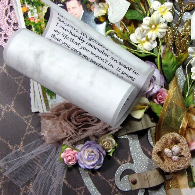
Something that has become very routine with me lately is to store my journaling in the form of a scroll.  I have a brief tutorial on how I go about making my scroll journaling right here on my blog.  You can find the tutorial here.  I had a good amount of story telling for this page & storing the journaling in the form of a scroll doesn't take up too much space on my page & makes for a unique embellishment!
The number '5' represents the number of years we've been married.  I added simple texture to my number--I inked up the number with embossing ink & heat embossed it with Star Dust embossing powder by Stampendous.  In person, this number gives off a lovely shimmer.

Here you can also see a small glass vial that I filled up with colorful beads from my stash.  I tied a bit of twine around the neck of the bottle.  The twine is from Riddersholm Designs.

A long strip of dark orange burlap ribbon is in the foremost background of my page.
I used a couple of ivory colored rosette flowers, mini pinecones & other random Fall themed embellishments from my stash.  The fabric dark brown leaves are by Prima.
This large fabric orange flower is by Prima.  I tucked a bit of yellow & green tulle underneath this large flower to soften the page a bit.
This is the acrylic Pennant Banner by Clear Scraps.  I altered this banner in several ways.

First I colored them with several alcohol inks.  I used Lake Mist, Copper, Meadow & Sunset Orange alcohol inks.  On some of the banners I randomly applied drops of alcohol ink directly from the bottle.  This creates more dramatic designs on the acrylic.  Next with my crop-a-dile I punched 2 holes into each banner, ran green ribbon through them & finally a string of dark brown burlap twine to hold my banner together.  Last step was to add dots of Gold Stickles all along the edges of each pennant in order to define them more.
This flower was handmade.  I used a piece of a 12x12 Acrylic Sheet by Clear Scraps to create it.  I shared a tutorial on how I created this flower over on the Clear Scraps blog.  So if interested, feel free to check it out.

Thanks to all of you who stop by for a visit.  Enjoy the rest of the week!
Photobucket

Tuesday, July 24, 2012

The Beginning & Beyond Layout

Good evening fellow scrappers!  Today's page is for one of the latest Bird is the Word (BITW) challenges.  The challenge is to use the word 'Beyond'.  I've incorporated it as part of my title.

This photo was taken on our first wedding anniversary.  We were married in the Fall which is both our favorite season & also makes for some colorful scrapbook pages!  Since this was our first year married I titled it 'The Beginning & Beyond' which is how I felt at the moment.  It was barely the beginning of our lives together and we were both anticipating what was beyond this first year together.
I manually tore a piece of corrugated cardboard and went mixed media crazy with it!  I gave the corrugated cardboard lots of texture by combining a bit of molding paste, mists in shades of browns, oranges & reds and randomly heat embossing with some gold embossing powder by Stampendous and Fake Bake Enamelz embossing powder by Shimmerz.
I've once again stored my journaling in the form of a scroll. If interested on how I went about creating this scroll--find the tutorial for it here.  This has quickly become my favorite way of storing lengthy journaling.  Instead of hiding my journaling behind my page like I used to--my journaling is now a unique embellishment to my page!
The large chipboard tree is by Dusty Attic.  Just like the background I used a variety of mixed media to give it texture.  It was first painted with dark brown acrylic paint then randomly heat embossed with a bit of mahogany distress embossing powder.  With my finger I spread a bit of Vintage Photo Distress Stickles randomly on the branches and finally with my finger again I added a bit of Martha Stewart brown leaf glitter here n' there on several of the branches.
Finally my cluster of 'Autumn' themed flowers, bits & bobbits.  Many of these items are from my own stash.  The large brown fabric flower is actually a left over from a kit I bought from the Funtoolas Etsy shop.

The transparent butterfly resting on the Prima nest is a butterfly from my small Etsy shop--you can find this butterfly & many more in my shop here.  I tucked a bit of tulle underneath my large brown fabric flower & the bright yellow bird is also from my stash.

Thanks to all of you who stop by for a visit!  Have a great rest of the week!
Photobucket

Monday, April 23, 2012

Look Within Yourself Layout BITW Guest Designer

Good evening fellow scrappers!  Today I'm sharing a page that I made for the latest challenge going on over at Bird Is The Word (BITW).

I was given the opportunity to guest design for them & I'm very grateful for the chance!  Thank you again Wendy.

I received an either/or challenge. I had to use either the word 'Look' or 'See'.  As you can tell from my title...I went with 'Look'.

I went back to one of my original & fave scrapbook styles which is grungy.  This young guy is actually a co-worker/friend of mine.  He's a sweetheart & has a heart of gold--all he has to do is believe a little bit more in his own capabilities.  So when I rec'd this challenge the first phrase that popped into my head was 'Look Within Yourself' and followed closely by that was my co-worker.  The piece of advice I'm giving him is in the journaling/title which reads: To find the answers to your questions...If searching for the strength to push ahead...When seeking for a reason to smile...Simply Look Within Yourself


I did much distressing, ripping & wrinkling on this page.  The edges of the page were distressed with my Zutter Distrezz-It-All.

TIP: To create the large wrinkle effects shown in this close up--first wet the paper with water.  I have a 2 oz mister bottle by Ranger that does a great job at wetting the paper just right for this kind of technique.  Once the paper is wet simply wrinkle it up with your own fingers.  Don't be afraid to scrunch away.  Once you get the wrinkles just how you want them take a heat gun to it & dry it up.  The paper dries wrinkled & stays that way.
The chippie is by Dusty Attic.  I left it raw for this page--meaning I didn't ink or paint it.  All I did was heat emboss it with some Star Dust transparent embossing powder by Stampendous & added a couple of rhinestones to further decorate it.
The clock was cut with Tim Holtz's die called Weathered Clock & grungeboard.  I then inked it with a medium coat of molding paste and randomly spread a bit of gold embossing powder & Fake Bake Enamelz by Shimmerz.  Then I took my heat gun to it & heat embossed it.  By using the molding paste the embossing powders dry with a much more 'puffier' texture which I really enjoy on masculine pages.
A closeup of the journaling & the metal flowers.

Journaling was printed on vellum from my computer & then manually ripped out.  The rest of the title was done with my Dymo Caption Maker & letters from my stash.

The flowers are a combination of metal mesh & mulberry flowers.  I have thin metal mesh in my stash that I used with my Big Shot & the Tattered Floral die by Tim Holtz.  To define the petals of the metal flowers I added a bit of puffy paint to the edges & heat set them.
I printed the photo four times & randomly layered them.  The photo is matted with scraps of paper that I manually & randomly ripped.  I also tucked a bit of burlap in either corner.

Here you can also see the large metal mesh flower that I combined with aluminum foil.  The aluminum foil layer of the flower was made by utilizing the same technique I showed in my 'Faux Metal & Acrylic Flower' tutorial.  You can find that tutorial here.  Only difference is that for this photo I did not incorporate any acrylic.

Thanks to all of you who stop by for a visit.  Your time is always greatly appreciated.  Do feel free to stop by BITW & check out their challenges.
Photobucket

Friday, February 24, 2012

The Journey Awakens the Soul Layout


Happy TGIF fellow scrappers! I can't say that I'm not thrilled that it's Friday & the weekend is ahead of me. Just being able to sleep past 6:30 a.m. is such a treat!

Today's page is based on a vacation to Puerto Rico my husband & I went to just this past September. It was our very first vacation where we actually went with friends. It was different for us--but a good kind of different. You definitely bond in ways you never thought of when you travel with others who are not family. You learn from one another & you simply get to know each other better! We all work in large corporations where stress is a common part of our daily routine. So this trip truly did 'awaken our souls'. We so very much needed the escape. I'm glad our trip went well and we hope to do another one soon!

This photo shows all six of us in Fort San Cristobal in Old San Juan. I have very limited photos where all six of us are together since it was usually one of us taking the group shots. For this photo I remember positioning the camera on top of a trash bin & setting the timer! Hey...it worked right?

I'm submitting this page for two challenges. Bird is the Word (BITW) for their Journey challenge & Once Upon a Sketch (OUAS) February 15th challenge. For OUAS the challenge was to scrap vacations. Either a recent vacation...one I'd like to go on or a favorite vacation.

Here's the sketch provided to us by Nadia over at OUAS.

I went with green embellies/accents to go along with my page. The papers are a combination of Prima & BoBunny.

The large swirls on the side are actually stamps by Prima. I stamped the swirls with Staz On Jet Black Ink--then cut along the flourish to create the border. I then further decorated the swirls with Stickles.

Lime green trim by Websters Pages was tucked underneath my scroll border.

The light green/silver flourishes are by Tim Holtz & made out of grunge board. They were first painted with a lime green acrylic paint. I then randomly dabbed a bit of Silver Paint Dabber on them. Finally, they were inked with embossing ink & heat embossed with transparent Star Dust embossing powder by Stampendous. In person, these flourishes give off a fabulous dimensional shimmer.

The journaling was made with my Dymo Caption maker and the title is actually a stamp by Tim Holtz (Stampers Anonymous). I stamped the image onto a transparency with embossing ink & heat embossed it with black embossing powder. NOTE: You have to be a bit careful when heat embossing on transparencies--you don't want to melt or warp the transparency. So it takes a light hand and a bit of patience. However, the end result is worth it. It's hard to tell from the photo but in person the title has a dimensional, almost epoxy look to it.

I punched a few holes into my large black circle & tied some lime ribbon through the holes. The transparent compass and globe is by Tattered Angels. The mulberry flowers are from my stash, the resin flowers are by Prima and the fabric rosette is by BoBunny.

Thanks to all of you who stop by for a visit...your time is always very much appreciated! Have a great weekend.
Photobucket

Wednesday, January 25, 2012

It All Began With A Promise


Good evening once again fellow scrappers! Seems like I've had a very productive January! I think this is the most I've posted in one month. :-) Let's just say that I started the New Year with lots of inspiration!

Today's page I made for the Bird Is The Word 'Promise' challenge & for Case #3 going on over at C.S.I. I think that the other reason for my consistent scrapping is these challenges that I've been participating in. They really do motivate you to scrap those pages.

This is my husband & I on our wedding day. Hard to believe that we're already heading into our 5th year of marriage.

Here's the challenge for C.S.I containing the color scheme I used on this page. The colors were more towards the pastel side but I took the darker shade of brown & made that my primary color. I then went with the lighter colors for everything else. Just a bit out of my comfort zone but that's what these challenges are about.

The bird cage is a wooden embellishment by Kaisercraft. The cute little bird on the cage I bought from Lidia's Etsy store--just one of several cute embellies she has in her shop.

The title is on a chipboard label by Dusty Attic. To give the chippie that metallic look--I first painted the chipboard with an ivory metallic acrylic paint. I then spritzed it with Pralines & Cream & Cashmere Smooch.
TIP: Want a unique way to store lengthy journaling but not exactly 'hide' it? Why not display it on your page as a scroll? As you can see from this photo--I used a scroll to hold my journaling & to add a unique embellishment to my page.

Just print your journaling on paper or vellum (or both like I did) & roll it up. Then take a pieces of scrap card stock or thick patterned paper--& cut two strips of paper about 1 3/4" inches long by 1/2" wide. NOTE: make sure that you use fairly thick card stock/patterned paper for the makeshift straps you're going to use to hold your scroll. If you use thin paper--the straps will most likely rip. Finally adhere the straps to your page making sure to leave enough room to slide your scroll through. NOTE: Use brads to decorate the ends of your straps. I adhered the brads to my straps as decoration. The straps are glued to my page with strong adhesive instead. These makeshift straps are what's going to hold your scroll in place so they have to be adhered very well onto your page. I felt that adhering them directly to the page with brads may end up ripping my page. So that's why I went about it this way.


Here's my scroll journaling taken out of it's holding spot. Once done, simply roll it back up & tuck it back into your straps!

As I mentioned in an earlier post--one of my resolutions was to use up the tons of ribbon in my stash. So I intertwined a bit of sheer gold ribbon amongst my flowers & Prima vine.

I once again used a bit of tulle for this page to give it a softer, delicate feel.

The cute little charm that I have hanging from my large mulberry paper rose with a Tim Holtz memo pin was also purchased in an Etsy shop. This one is owned by a very nice lady named Kat and her store Beyond Charms is full of lots of lovely charms just like this one that can be added to any page/card/project.

The two large light brown shabby roses was also bought at an Etsy store. Seems like I did a lot of shopping in Etsy for this page! That's the beauty of owning an Etsy shop of your own--you tend to support your other fellow crafters that are in the same boat as you. These shabby roses can be found over at Frog Feathers along with many other fabulous trims, lace & miscellaneous embellishments. The light pink crochet doily I also bought from Frog Feathers.

Finally an owl glimmer glass embellishment by Tattered Angels. I used a resin cameo by Webster's Pages for the owl's tummy.

Thanks to all of you who stop by for a visit!
Photobucket

Friday, January 20, 2012

Remember 2011 Layout


TGIF fellow scrappers! Today was one of those Fridays that I refer to as 'Fiesty Friday'. Everybody was hyper at the office...not much work got done & we were all for the most part simply happy! Not sure if we're all burnt from the amount of work we've been having lately or we're all anticipating our supposed first 'snow storm' of the season or if there's just something in the air--but it was a great Friday!

I was also able to wrap up this page that I'm submitting for several challenges.

The first is for the Once Upon A Sketch (OUAS) January 15th challenge. The challenge was to journal about New Year's. Either 'Hello 2012' or 'Goodbye 2011'. I decided to journal about the one memory that most stood out in my mind for 2011--so I guess I went with 'Goodbye 2011'. I absolutely love this one photo me & my husband took while vacationing in Puerto Rico. The time, the place & the meaning behind it--just meant a lot to me. I've already scrapped it once before. You can see my first take of it here.

This is also being submitted for Case #2 going on over at C.S.I. I'm really enjoying their Alice in Wonderland theme.

Finally, this page also fit the requirements for the Bird Is The Word (BITW) 'Remember' challenge.

Here's the sketch provided by Nadia over at OUAS. I'm a fan of circular elements--so this sketch got my cogs & gears going as soon as I saw it. :-)

This is Case #2 for C.S.I. The colors for this case took me a little out of my comfort zone. I tend to be more of a 'grungy girl' & lean more towards the brownish/vintage colors & I don't tend to mix too many different colors on one page. However, all these bright colors just seemed to work/blend well together!? Who would've thought!

Ok, let's start with the close ups. The circle frame chippie is by Dusty Attic. I gave it the iridescent paint/embossing texture that I'm quite fond of when it comes to chipboard. I first painted the chipbard with metallic teal/green acrylic paint. With a white Sharpie paint marker I highlighted the edges of the flourishes on the circle frame in order to define them a bit more. Next, I inked the frame with embossing ink & heat embossed it with Kaleidoscope clear embossing powder by Stampendous. This particular embossing powder gives off this shimmery iridescent texture that is so very pretty in person & hard to truly capture with a camera.

The yellow butterflies I cut out from a Hambly overlay that I've had in my stash since before time. I finally found a use for it! :-) I wanted the butterflies to look as if they were flying out from behind the photo.

TIP: Want to try out a dimensional way of matting your photo? Simply rip & tear scraps of paper with your hands & layer them!

I ripped & tore several pieces of two sided paper straight & in angles. NOTE: This works best with two sided paper that has one light side & one dark side. I inked all the torn edges with Tea Dye Distress ink. I then layered all of these torn pieces one on top of the other in different angles & curled the edges on some of them. As I adhered the layers I tried to alternate the sides of the paper I used (dark versus light). This gives the effect of having many pieces of paper matting the photo when in reality it's just bits & scraps that are just layered one on top of the other.


One of the main reasons I love this photo so much is that I find it sweet & romantic. Sweet & romantic = tulle in my book. Tee-hee. There's something about tulle that 'softens' a page. So for the first time, I've incorporated a bit of tulle in my layout. I kept it simple. Just took a piece of tulle, tied it with a knot & then adhered it to my page. Done.

I also made the New Year's resolution to use up the tons of ribbon I have in my stash. So once again I've intertwined a piece of ribbon amongst all of my floral embellies.

The brick wall I traced with a fine point black marker and a Prima brick mask.

The random yellow misting was done with Yellow Daisy Glimmer Mist.

The gate stamp is by Prima. As I tend to do--I stamped my image on a transparency with StazOn Jet Black ink. This way I can place my image anywhere I wish & I don't have to worry about stamping it on crooked. I have total control of how my image will display! Yay!

A close up of the other cluster of embellies. The resin bird is by Prima. You can see my second tulle accent here as well.

I also used two small white doilies on either side of my matted photo. Since they're white like my background they add a soft subtle touch.

Finally...my hidden journaling. Ta-da! Turns out that one of those torn edges on top of my photo is actually a pull out tag where I hid a bit of nostalgic journaling. Journaling reads:

This was it. This was the defining moment of 2011 for me. This is the one memory I do not want to forget. One the eve of our 4th wedding anniversary we took a 'classic' photo during our vacation to Puerto Rico. One that I hope our future son or daughter will maybe one day try to reproduce. It's timeless. It's romantic...it's us.

Hope you all have a fabulous weekend & a big thanks as always to those who stop by for a visit.

Photobucket

Tuesday, January 10, 2012

The Wonder Of You Layout


Good evening fellow scrappers! Today I bring you a pastel Christmas page. Now, pastel colors are not my norm when it comes to scrapbooking--I tend to go more for vintage/grungy colors. However, I really like how this page came out! For some reason these two photos of Toby sitting on Santa's lap alongside Santa's Little Helper said 'pastel' to me. So pastel it was.

Isn't my Toby a little ham? I swear he 'smiles' for most of his photos--these two being no exception. He's such a little character...

I've used papers by Pion Designs from their Santa's Little Helper II line. These papers came with the December kit by Funtoolas--a very cute Etsy shop filled with delicate embellishments & very well coordinated kits for scrapbooking. This will be the third page I've completed with elements from this kit. Needless to say, I've thoroughly enjoyed this kit!

The peach crochet doilies are also from an Etsy shop titled 'Frog Feathers'. This little shop has lots of trims and other goodies that can be used for scrapbooking.

I'm submitting this page to the Bird Is The Word challenge blog. This page is for their 'Wonder' challenge.

The title is a combination of clear labels made with my Dymo Caption maker & letters adhered to a piece of clear acrylic/transparency. I've been using transparencies more & more on my layouts because it offers more dimensional possibilities. If you're a dimensional lover like yours truly--then this is the way to go.

TIP: To position titles over ribbon, beads, pearls, brads or any other bulky embellishment--consider adhering the letters to a piece of transparency. As shown here the word 'wonder' was first adhered to a piece of transparency and then adhered over my string of pearls. You can't even see the transparency which makes it look like the word 'wonder' is perfectly balanced on my string of pearls!

Speaking of pearls...I've had strings of pearls in my stash for the longest time in all sorts of colors. I figured it's about time I started using them. So lately I've been adhering them in a random sorta way onto my pages. I just like the randomness they supply to the page.

I've taken out my splatter stamps once again for this page & have randomly stamped splats & splatters in the background. This stamp set is by Recollections & I found it at my local Michaels. The snowflakes & black flourishes are also stamps--these are by Inkadinkado.

The two large white crochet snowflakes came with the Funtoolas kit.

I once again used a bit of cheese cloth to mat my photos. I am loving the effect cheese cloth gives when tucked behind photos.

The black flourishes were stamped on acrylic. TIP: Stamping your images on acrylic/transparencies gives you much more flexibility on the placement & orientation of your image. For example the flourish is actually the reverse image of the actual stamp. I liked how it looked better reversed. If it wasn't for the transparency--I wouldn't have this option.

I further decorated the black flourish by adding some clear rhinestones & Star Dust Stickles.

A close up of the snowflakes border chipboard. I first painted the snowflakes with metallic blue acrylic ink. I then randomly dabbed a bit of Silver Paint Dabbers on them by Ranger. Finally I randomly spread adhesive & sprinkled a bit of Fairy Dust Glitter by Donna Salazar on them. They're even more shimmery in person!

These dimensional Christmas trees are making their second appearance. I first used these in my 'Magic' layout. I have made a tutorial for these trees & will post it soon. They are actually a stamp that I've altered to give the trees lots of depth/dimension.

Thanks to all of you who stop by for a visit! I'll be back soon.
Photobucket