HOMEABOUT MERESUMETUTORIALSMY FAVES

Sunday, October 30, 2011

Us Layout


Good morning fellow scrappers! It's reveal day over at Sketchabilities. I decided to go with a 'clear' approach to this fabulous sketch by Karan. So I went with one of Clear Scraps XL shapes as the base for my page. All the papers used were from Bo Bunny's Time Piece collection--a collection I've had in my stash for a while now & I've been really itching to use!

This is me & my husband--a rare cutesy picture that we took. Don't get me wrong--we're actually a very loving couple; we just never have anyone around to take pictures of us. Usually we have to have what I call 'amateur photo sessions' where I setup the tripod somewhere in the house, put the camera on a timer & we snap away! This picture is the result of one of those 'amateur photo sessions'.

Here's the sketch the page is based on. Once again a versatile sketch by Karan that can be interpreted in many creative ways--let your imagination be your guide!

Here's a closeup of some of the trinkets this page has. There's a metal clock by Tim Holtz, a metal key & a clear tiny glass bottle also by Tim Holtz. I filled the glass bottle with a couple of black beads that I had in my stash. The dimensional paper clock is a coordinating embellishment for Bo Bunny's Time Piece collection.

The title was created with a combination of acrylic paints & distress Stickles. TIP: To get the effect of a two-tone color on chipboard first paint the chipboard with the lightest color. Once dry paint 1/2 of the chipboard with the darker color. Finally apply a heavy coat with coordinating distress Stickles. For this page I used Antique Linen & Aged Mahogany Distress Stickles. Where the two colors meet slightly go over the border of the two colors with your Stickles. This will 'blend' the two colors at the meeting point.

For the border I used a combination of molding paste & Aged Mahogany Distress Embossing powder. With a paint brush I dabbed some of the molding paste along the border & then sprinkled the embossing powder & heat embossed. The molding paste in combination with the embossing powder gave a defined border on my page. TIP: When heat embossing on acrylic, make sure you do not put the heat gun too close to the acrylic or else your acrylic will melt.

The flourish chippies are by Dusty Attic. They were treated with Cashmere & Pralines & Cream Smooch by Donna Salazar. Then with my finger I lightly spread some adhesive on them & sprinkled a bit of Pralines & Cream Fairy Dust glitter also by Donna Salazar. Loved the effect the combination of this media gave me.

The clock chippie was also treated with the same combination of media as the flourishes.

A big thanks to all of you who take the time to visit. For more inspiration please visit the Sketchabilities blog to see the other talented DT's take on Sketch #58--and if you have the time--please do play along with us!

Photobucket

Saturday, October 15, 2011

Essential Cog Layout


Good morning fellow scrappers! Today I have my very first Sketchabilities post!

This page is based on non other than my little fur-baby Toby. I sometimes refer to him as our 'essential cog' because he's such a character; his personality is about triple his tiny size. He's become such a part of our family that when I have to take him to the groomer & he's not around for those couple of hours--the house simply doesn't feel 'right'.

These pictures are from the fall of 2008. My husband was in our backyard raking leaves & as you can see in the pics Toby was by his side the whole time as if he was helping him. In the smaller bottom picture you can see how tiny he was back then--yet he never missed a step! He's so tiny that I used one of the gears to frame him so he can stand out in the photo! :-)

I've used papers from Basic Grey's Pyrus collection. This is also a DT project for Stamp Enjoy.

This is the Sketchabilities sketch used. It's a versatile sketch & it leaves room for interpretation--so expand that creative imagination!

A close up of one of the corner stamps by Stamp Enjoy. I stamped it first on a transparency & then cut it out. This way I was able to position the image exactly where I wanted.

You can also see a bit of the hand stitching here. I combined both the zig-zag stitch with the straight stitch.

The gear chippies are by Dusty Attic. I actually cut one of the large gears in half. I placed one half on the upper right hand corner of the picture & the second half in the lower left hand corner.

The black gears where painted with black acrylic paint. They were then inked with embossing ink & heat embossed with Star Dust transparent embossing powder by Stampendous.

The light grey gears were painted with grey acrylic paint. Once dry I applied a heavy coat of Pewter Distress Stickles. Finally I inked all the edges of the gears/cogs with Black Soot Distress ink.

The flourishes were hand stitched. I used a flourish paper piercing template as a guide.

A close-up of the large woven stitch. You can find a tutorial for this woven stitch here. I've done this large stitch diagonally, horizontally & in a circle. It adds a nice touch to any project.

This vintage car is also a stamp by Stamp Enjoy. Once again, I stamped the image on a transparency in order to place it exactly where I wanted.

Be sure to take a peek over at the Sketchabilities blog to see how the other DT's interpreted this fabulous sketch! I'm sure you'll find much inspiration.

Photobucket

Wednesday, October 12, 2011

Corner Punch Flowers Tutorial


Good evening fellow scrappers! While going through a couple of scrapbooking sites I stumbled upon this link on the Fiskars site. It shows how one can make decorative flowers with Fiskars corner punches. I unfortunately don't have many Fiskars corner punches--I do however have a good amount of Martha Stewart corner punches (sorry Fiskars). So I tried to see if there was a way I could leverage the Fiskars tutorial & apply it for Martha Stewart corner punches & here's the end result.

All you need is a bit of free-form cutting to get the petals just right. I don't have all the Martha Stewart corner punches--but so far I've tried with four different ones & the flowers have come out fine! So I'll let you, the reader, experiment with other Martha Stewart corner punches & if you can, do let me know if this tutorial works for you as well.

These flowers are also great for using up scraps & since two of the squares required are 2" x 2" inches you can also use the squares found in the Tim Holtz paper stacks for these flowers. I've actually cut out a few of these squares--which all happen to be exactly 2" x 2" inches in size--for these flowers.

So let's get started!

Tuesday, October 11, 2011

Year 4 Layout


Hello once again fellow bloggers & scrappers! Today's page displays my most recent favorite picture of my hubby & me. This photo was taken on our recent vacation to Puerto Rico & in celebration of our 4th wedding anniversary. Four years. Has it really already been four years!? It honestly feels like just yesterday that I was taking my vows. Where does time go?

I used papers from Bo Bunny's Gabrielle collection. The entire background is stamped & I added additional stamping to my main page. I also went Distress Stickles happy when adding texture to the brick chippies! Distress Stickles really add amazing texture to just about any chippie.

The design of the page is based on Once Upon A Sketch's October 1st challenge sketch. The requirement for this sketch was to have at least one sentence of journaling noting why the event that was being scrapped was noteworthy. My journaling reads: This picture was taken on our very first day out exploring Puerto Rico & on the eve of our 4th wedding anniversary. A memory captured eternally against the walls of a historic fort that is centuries old.

I used white acrylic paint to stamp the brick wall in the background. With a brush apply the paint to your stamp. Apply a thin layer...do not glob your paint on or else you'll have globs on your page as well! TIP: Remember to clean your stamp as soon as you're done stamping. Once the paint dries it'll be much harder to clean. Stamp used is by Layers of Color (Brick Wall).

Even with a thin layer of acrylic white paint, the wall dried with an amazing raised texture. In person, it's almost like an embossed white brick wall in the background.

I cut out two pages in the same bracket shape & off set them slightly. I tried to bring out the subtle orange hues of this paper line. This is why you see the bright orange splashes throughout the page.

I stitched along the bracket border & added dots of Orange Peel stickles along the edge.

The chain bridge is by Dusty Attic. I painted this with a dark brown acrylic paint & then added Cinnamon Stickles.

The journaling was printed on ivory vellum. I then adhered the vellum to cream colored cardstock & inked the edges. I then stamped some splatters on the journaling with Tea Dye distress ink. The journaling is adhered with pop dots for added dimension.

The loop flower is hand made. I used Martha Stewarts corner Loop punch to make it. I've made a tutorial on how to make these corner punch flowers. If interested, you can find the tutorial here.

In the bottom corner you can catch glimpses of the script stamping. This stamp is from Tim Holtz's Mini Ornate collection.

This butterfly can be found in my Etsy shop. It's one of the new 'fall' butterfly additions to my shop. The splash of bright orange against the dark brown was just right for this page. I adhered the butterfly to the daisy with hot glue...it's a quick way to adhere an embellishment in precisely the right spot.

Finally, a close up of the brick wall also by Dusty Attic. I used two shades of orange for the brick walls. The upper bricks were painted in a bright orange acrylic paint. I then applied a thick layer of Spiced Marmalade Distress Stickles. The bottom bricks were painted with a darker orange/brown acrylic paint. I used Rusty Hinge Distress Stickles for these bricks.

Thanks for stopping by & for taking the time to visit!
Photobucket

Wednesday, October 5, 2011

Capture The Present Instance Layout


Hello once again fellow scrappers! Today's page is one I made for Stamp Enjoy. I did some masking, stitching & as usual, a bit of stamping for this one.

The photos are of me & my husband while on a brief weekend getaway to Cape May, NJ. While walking around I found one of those photo booths that take continuous shots--I've always wanted to try these photo booths & make various funny faces as the camera went off--well here's the result of my little adventure! I think I'll be specifically seeking these photo booths out in the future b/c they make for great memories, fabulous candid shots & an excuse to scrap really fun pages.

This is a close up of the Roses stamp by Stamp Enjoy. I added Crystal Stickles to the image to dress it up a bit more.

The title is also a stamp by Stamp Enjoy. As you can see, I have a tendency of dressing up my stamps with either Star Dust or Crystal Stickles. I really like the added dimension the Stickles add to my stamped images.

A close up of the stamped flourish. This stamp is by Prima & is from their Build-A-Swirl stamp line. I used black Staz-On to stamp the image...this gives the image a crisp sharp look. I also further dressed up the swirl with Crystal Stickles.

On this screen shot you can also see the circle stitching & the scalloped circle masking.

A close up of one of the three shimmery flowers. I made these flowers with water color paper. I have a brief tutorial on how I went about making this flower. If interested, please feel free to view the tutorial here.

The bird cage is also a stamp by Stamp Enjoy. For this image I first stamped it onto a transparency with black Staz-On & cut it out. This way I was able to position it exactly where I wanted on my page & the stitching & masking was underneath the stamped image instead of above it.

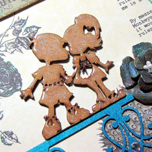
Finally, a close up of the kissing couple. This is actually not chipboard--these are laser cut wooden images that I ordered from a French company called Scrap Desirs. I did not color in the design at all. I left it it's natural color. To give it that 'epoxy' look. I first inked it with embossing ink & heat embossed it with Kaleidoscope transparent embossing powder by Stampendous. I then embossed it three times more with Ultra Thick Embossing Enamel (UTEE). UTEE is what gave the design a thick epoxy look & the Kaleidoscope embossing powder is what gives the image it's bling.

The 'fence' the kissing couple is standing on is a chippie by Dusty Attic. I painted the chippie with a dark turquoise metallic paint.

TIP: To give any chipboard, cardstock or even flowers an 'epoxy' look--try embossing it with UTEE.

Thanks to all of you who drop by for a visit! I hope this inspired some of you to try UTEE in your next project.
Photobucket

Sunday, October 2, 2011

Water Color Paper Flowers Tutorial Take Two


Good evening fellow scrappers! I'm back from a one week vacation to the Caribbean. I'm rested & ready to get my life back on track--but do I really want to do that!? No, actually I do not...but I don't have a choice. Sigh...so it's back to work tomorrow. Cue very long sigh...but, before I go back I figured I'd post this small tutorial on a second set of flowers I made prior to me leaving for vacation. These are also made out of water color paper. You can see my first water color paper flowers here.

For these flowers I used the Spellbinders Donna Salazar dies titled Rose Creations. I used the second to large flower for the bottom layer, a medium flower & small flower for the other two layers. You can make these flowers in any size you desire. Just remember to use a different size rose per layer. So let's get started!

Wednesday, September 21, 2011

My Sweet Little Boy Layout


Good evening fellow scrappers! Today's page is one based on my little Toby. He's my very first dog & he never ceases to amaze me. It's like he's a 2 year old little boy trapped in a furry body. You can always tell what he's feeling or trying to convey with his facial expressions. He understands everything you tell him & he even seems to be bilingual since my husband always speaks to him in English & both my mom & I speak to him in Spanish. Regardless, he understands what we're telling him! To me, he's my sweet little boy & always will be.

This is a DT project for Stamp Enjoy. Once again the entire background is stamped/misted or inked.

Here's a close up of one of the 2 large flowers seen on this page. I have a brief tutorial here on how to make these flowers if interested. They're very simple, but add a nice touch.

This page is also for the "Stick With Helmar September Challenge". My friend Natasha gave me the heads up about this site & I went simply to be nosy! :-) However, when I saw this sketch I absolutely LOVED it & found that these pictures of me & Toby that I've been wanting to scrap for a while were just right for this sketch. I was lucky enough to have a bottle of Helmar's 450 Quick Dry adhesive in my stash (sometimes it pays to just buy everything in sight) & decided to give this sketch challenge a try.

I used safety pins as embellies. I have tons of safety pins that I bought ages ago & never figured out how to incorporate them into my pages. Well, this is a very simple way to add a couple to a page. So I used about 8 pins out of my 800...it's a start! :-)

A close up of one of the stamps by Stamp Enjoy. This one is called Petit Rond 1. All of the splashes & splats seen in the background are made with stamps. I used a combination of Vintage Photo distress ink & Anchor's Away Coloringz by Shimmerz for my stamping.

The largest circle was cut out of corrugated cardboard. I spread some Midnight Blue Stickles all over it with my finger.

A close up of the 'Puppy Love' tag.

This large circle is a stamp by Stamp Enjoy. It's called Bordure Rond 3. TIP: I wanted this stamp to be in a very specific spot. So instead of stressing myself out on the exact placement of the stamp--I stamped it onto a transparency with black Staz On & cut the image out. This way I was able to position the image exactly where I wanted.

A close up of the title. The chippie is from A2Z Scraplets. I kept the texture of the title simple. I painted it with navy blue acrylic paint--once dry I inked it with embossing powder & heat embossed it with Kaleidoscope transparent embossing powder by Stampendous. In person the title has an amazing shimmer.

Thanks to all of you who take the time to drop by...
Photobucket

Sunday, September 18, 2011

Water Color Paper Flowers Tutorial


Good evening once again fellow scrappers! It's a Sunday evening & I'm clinging to it for dear life. I REALLY don't want to go back to work tomorrow...but what can you do? Just keep playing the lotto & hope that Lady Luck will one day pay me a visit...

I thought I'd share a brief tutorial on how I went about making these flowers. They're made out of water color paper. Water color paper is excellent for creating flowers or any kind of embellishment where you wish to use pigment powders such as Perfect Pearls for applying color & shimmer. For this particular flower I used Mandarin Perfect Pearls with a hint of Copper. Besides any kind of pigment powders & water color paper (I found water color paper at my local Michaels; this should be available in any arts & crafts store) you'll also need a water color pen which can also be found at your local Michaels or arts & crafts store. So let's get started!

Wednesday, September 14, 2011

Ur Eyes (Say All) Layout


Good evening fellow scrappers! Today's page is one that I had absolutely no design mapped out in my head for--all I knew was that I wanted to scrap these two pictures of my husband. I just grabbed my stamps & stamped away & this was the end result.

This is a DT project for Stamp Enjoy.

My husband has these deep blue eyes. The complete opposite from my dark brown. At times, especially in the morning--they are crystal blue. I took these pics during one of these mornings. I told him to give me one of his 'sexy' poses. Well...this is a sexy as he gets folks! :-)

As mentioned, I did a lot of stamping & misting on this one. Just about the entire background is stamped. I used stamps from Stampin' Up, Tim Holtz & Stamp Enjoy.

In this close up you can see a combination of 3 stamps. Both round stamps are from Stamp Enjoy. They are Petit Rond 1 & Bordure Rond 3. The script stamp is by Tim Holtz.

Another close up of the same two stamps by Stamp Enjoy. The birds in flight stamp is by Tim Holtz. In the corners I punched multiple times with McGill hand punches of various round sizes. I think inked over the punched holes with yellow ink. Finally I filled the holes with Black Diamond Stickles.

A close up of the large chippie. This chipboard is by Dusty Attic. I painted the chippie with yellow acrylic paint. Once dry I dabbed embossing ink on it & then heat embossed it with Star Dust transparent embossing powder by Stampendous. This technique gives the chippie an amazing shimmer that is appreciated better in real life.

The metal flowers are by Prima.

This vintage car stamp is also by Stamp Enjoy called Voiture Ancienne. The stamp of the city skyline is by Tim Holtz.

Finally a close up of the 'bead stitching' I did. Basically these are just very large stitches & I thread multi-colored beads onto every other stitch.

Thanks to all of you who stop by--the visit is always very much appreciated.


Photobucket